Get a Quote
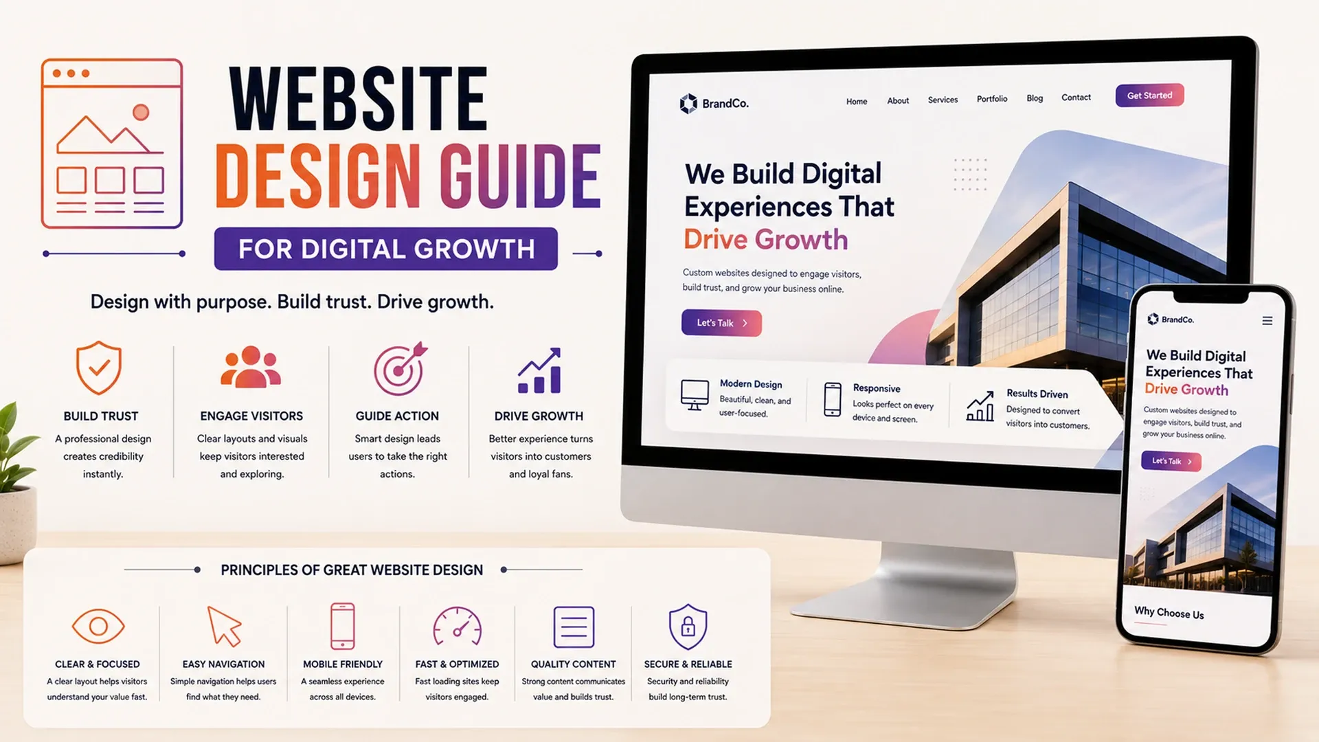
Learn how website design improves brand trust, user experience, responsive layouts, SEO structure, conversion flow, and digital growth.
A website has roughly a few seconds to convince a visitor the business behind it is worth trusting, long before anyone reads a single line of copy. A solid website design guide treats that reality as the whole point - design isn't decoration layered on top of a website, it's the first argument the business makes for itself, often before a visitor has any other way to judge whether the company is legitimate.
Building Visual Trust Before a Word Is Read
Visitors form an opinion about credibility almost instantly - research on first impressions suggests it happens in a fraction of a second - based on things they rarely consciously notice, like spacing, consistency, or whether the photography looks real or borrowed from a stock library everyone else uses too. Practical business website design tips usually start here, because no amount of persuasive copy recovers a first impression that already reads as generic or careless.
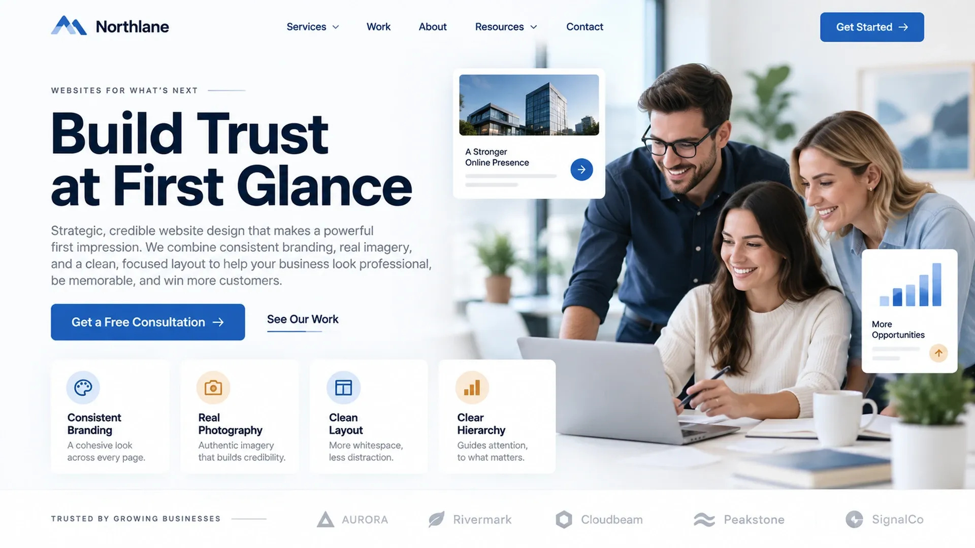
- Consistent brand colors, fonts, and spacing used the same way on every page
- Real photography and imagery instead of generic stock that competitors use too
- Enough whitespace that the page feels organized rather than crowded
- A visual hierarchy that makes the most important element obvious at a glance
Typography carries more of that trust signal than most businesses assume. A font pairing that looks slightly off, or line lengths that stretch uncomfortably wide across a desktop screen, register as sloppiness even to visitors who couldn't name exactly what felt wrong.
Designing Layouts That Work on Any Device
Responsive website design isn't only a development concern - the design itself has to hold up when a hero image, a five-column layout, or a wall of text gets compressed onto a phone screen. Designing mobile-first, then expanding up to larger screens, tends to produce cleaner results than designing for a big monitor and hoping the smaller version survives the shrink.
Text size and line length matter just as much as breakpoints. A paragraph that reads comfortably on a widescreen monitor can become an exhausting wall of text once squeezed onto a phone at the same relative width, so type scale and line length need their own adjustments at each screen size, not just the layout wrapped around them.
Guiding Visitors Toward a Clear Next Step
Conversion focused website design is less about persuasion tactics and more about reducing how many decisions a visitor has to make before taking the one action that matters most on that page. A single clear call to action, placed where attention naturally lands, consistently outperforms a page offering five competing options at once, since every additional choice is one more moment where a visitor might decide to leave and think about it later - which, in practice, usually means never coming back.
Good website design doesn't ask visitors to figure out what to do next - it shows them.
Keeping Design Consistent With Brand Identity
None of this works in isolation from the brand itself - a website that looks nothing like the logo, colors, and tone established elsewhere just confuses visitors moving between touchpoints. Design decisions here should trace back to the same foundation covered in our brand strategy and identity guide, with a logo that anchors the whole system rather than sitting disconnected from it.
That consistency extends to tone as much as visuals. A site that reads playful and casual while the sales team communicates in a formal, buttoned-up voice creates a subtle disconnect that visitors notice even when they can't quite articulate why something feels off.
Choosing Design That Fits the Page's Job
Not every page on a site is doing the same job, and design should reflect that. A homepage needs to earn trust broadly, while a page built to convert traffic from one specific campaign benefits from a narrower focus - which is exactly the territory our landing page design guide covers in more depth, since treating every page on a site identically usually means the homepage ends up trying to do a landing page's job poorly, and vice versa.