Get a Quote
Learn how brand strategy and identity shape positioning, messaging, visual systems, trust, consistency, and long-term business recognition.
Brand strategy and identity work together to answer a deceptively simple question: what does this business stand for, and how does that show up consistently everywhere customers encounter it? Without a clear strategy, visual identity becomes guesswork — colors and messaging chosen because they look nice, rather than because they reflect something true about the business and its audience. Businesses with a clear strategy make faster, more confident decisions about everything downstream, from hiring a designer to approving a new marketing campaign.
Positioning Comes Before Visuals
Before any logo, color palette, or messaging gets created, brand strategy starts with positioning: defining what a business does differently, who it serves, and why that matters to that specific audience. Skipping this step is one of the most common reasons rebrands fail to resonate — a business can end up with a beautiful visual identity that says nothing distinct about who they are or why a customer should choose them over a competitor.
Positioning gives every later decision, from color choice to tone of voice, a clear reason to exist.

Building a Visual System, Not Just a Look
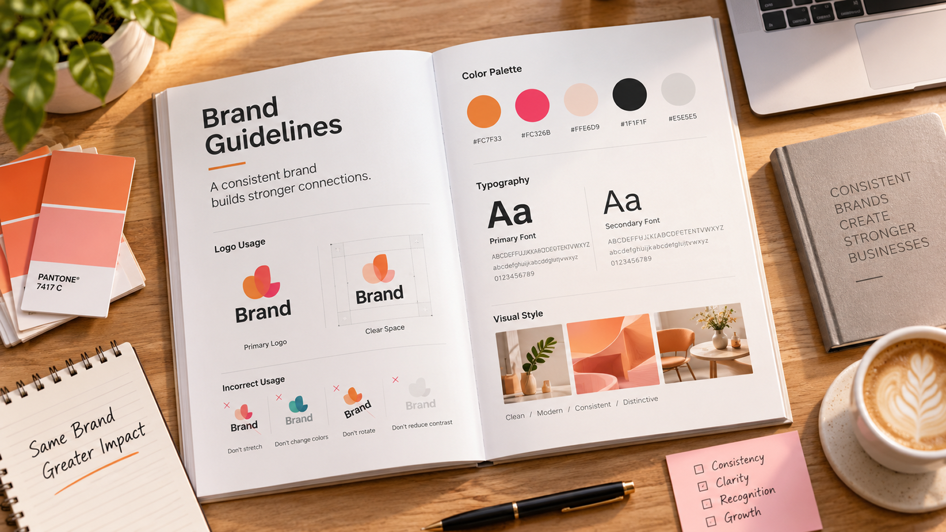
Once positioning is clear, visual identity best practices translate it into something consistent and repeatable. A complete visual system typically includes:
- A logo and its approved variations for different contexts
- A defined color palette with clear usage rules
- Typography choices for headings, body text, and UI elements
- Imagery and iconography styles that reinforce the brand's tone
Why Brand Guidelines Matter More Than They Seem To
Brand guidelines can feel like an unnecessary formality, especially for smaller businesses, but they solve a real problem: keeping a brand consistent as more people — designers, marketers, agencies — touch it over time. Without documented guidelines, small inconsistencies creep in gradually, until a brand starts looking different depending on who last touched it. Clear guidelines protect the work already done in positioning and visual design, making sure the brand still looks and feels the same two years and a dozen contributors later.
Keeping Brand Voice Consistent in Written Content
Visual identity gets most of the attention in brand discussions, but tone of voice does just as much work in shaping how a business is perceived, especially across the growing volume of written content most businesses now produce — website copy, social posts, support responses, and marketing emails alike. A brand that sounds formal and authoritative on its homepage but casual and joking on social media sends a confusing signal about who it actually is. Defining voice attributes clearly, with real examples of what to say and what to avoid — similar to how Mailchimp publishes its own content style guide — gives every writer on a team — internal or external — a consistent reference point, the same way a color palette does for visual design.
Revisiting Brand Identity as a Business Evolves
A corporate identity strategy isn't meant to be permanent — businesses change their audience, offerings, and market position over time, and a brand built for an earlier stage of the company can start to feel misaligned with what it has become. This doesn't necessarily mean a full rebrand is needed; often a lighter refresh of messaging, color emphasis, or visual details is enough to bring the identity back in line with the business. Revisiting brand strategy periodically, rather than only in response to a crisis, keeps identity work proactive instead of reactive.
Brand strategy and identity work best as a sequence:
- Clear positioning, defining what the business stands for
- A consistent visual system built on that positioning
- Documented guidelines, covering both visuals and voice, to protect both over time
Businesses that invest in this order, and revisit it as they grow, build brands that feel intentional and recognizable, rather than a collection of disconnected design decisions. For the visual mark itself, see our logo design guide.