Get a Quote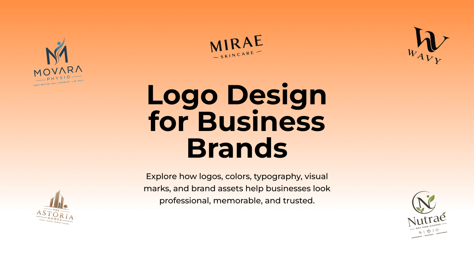
Learn how logo design supports brand identity, recognition, trust, typography, color systems, digital assets, and professional business presence.
A professional logo design is often the smallest design asset a business owns, and yet it carries an outsized responsibility: representing the entire brand in a single mark that has to work at a glance, across dozens of different contexts.
A strong logo doesn't need to explain everything about a business — it needs to be distinctive enough to be remembered and flexible enough to work everywhere the brand shows up.
What Makes a Logo Actually Work
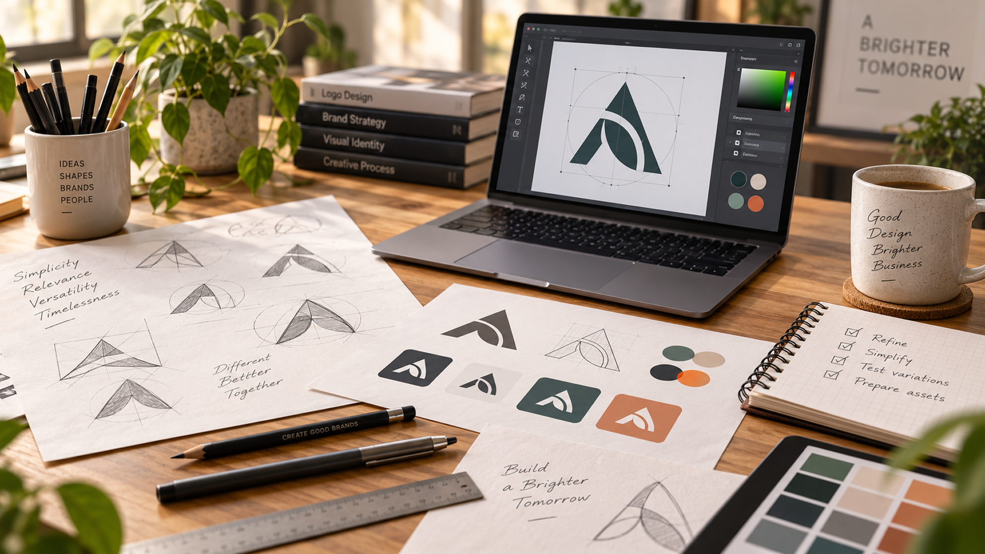
A well-designed business logo shares a handful of core qualities, regardless of industry or style:
- Simplicity, so the mark is easy to recognize and recall
- Relevance, reflecting something true about the business or industry
- Versatility, working in color, black and white, and small sizes alike
- Timelessness, avoiding trends that will look dated within a few years
A logo doesn't need every quality in equal measure, but ignoring any of them tends to cause problems later — usually right when the brand is scaling and consistency matters most.
Color and Typography Do More Than Decorate
Color and type are often treated as finishing touches, but they carry real meaning. Color psychology in branding shows how color choices influence how a brand feels before a single word is read — a deep blue like #003366 often reads as trustworthy, while a bright orange leans energetic — and those associations build up through consistent, repeated use. Typography works the same way: a rounded, friendly typeface communicates something very different from a sharp, technical one, even when the words are identical. Together, color and type do a significant share of the emotional work a logo is responsible for.
Designing for Every Surface, Not Just One
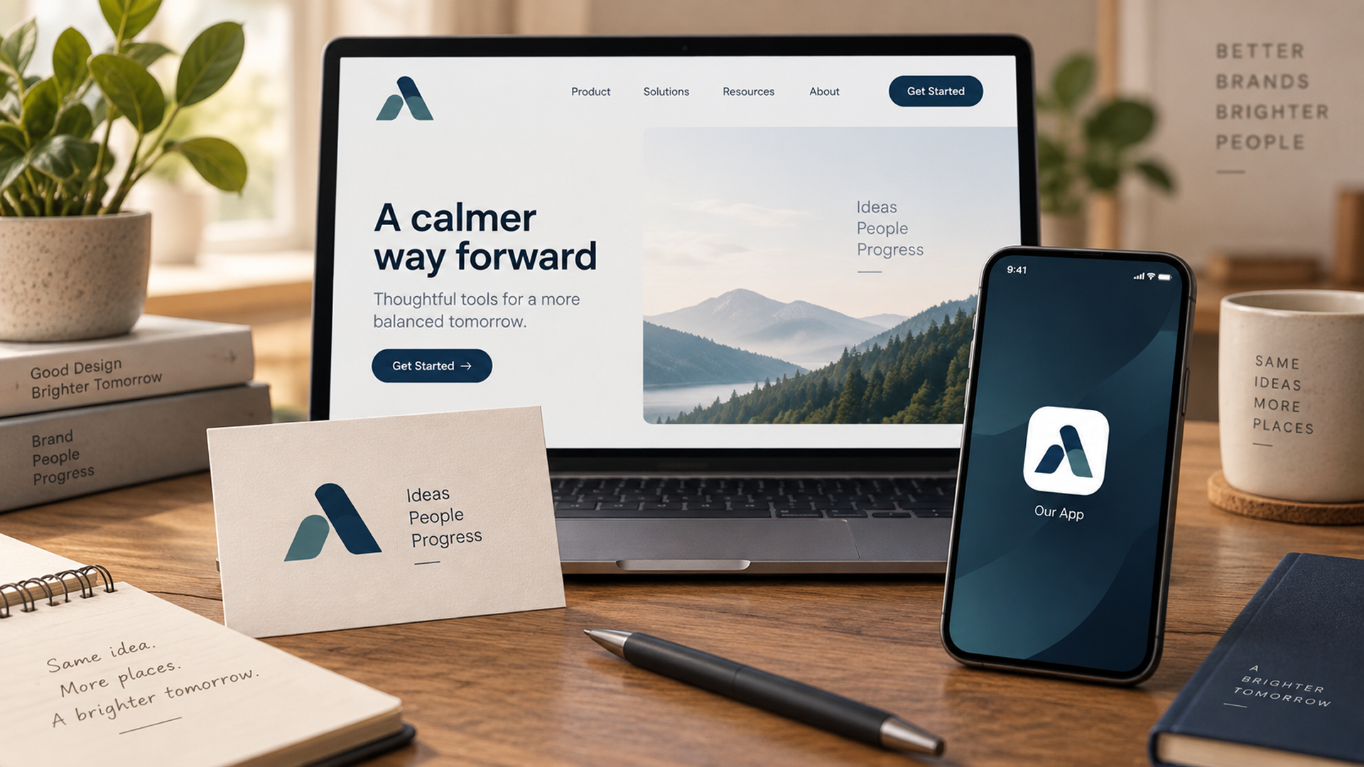
A logo rarely appears in just one place. It has to hold up on a website header, a social media avatar cropped to a circle, a printed invoice, and a favicon shrunk down to a handful of pixels. Designing with this range of surfaces in mind from the start — much like UI/UX design plans for every screen a product touches — prevents awkward compromises later, like illegible detail at small sizes or a mark that only works on a light background.
Common Logo Design Mistakes to Avoid
Many logo problems trace back to a handful of avoidable decisions made early in the design process. Chasing current design trends too closely is one of the most common — a logo that looks fashionable today often looks dated within a few years, forcing a costly redesign well before the brand is ready for one. Overcomplicating the mark is another frequent issue, with too many colors, effects, or fine details that fall apart the moment the logo needs to shrink down for a favicon or an app icon.
- Chasing trends instead of designing for longevity
- Adding unnecessary detail that disappears at small sizes
- Choosing fonts or effects that don't reproduce well in print
- Skipping real-world testing across the surfaces the logo will actually appear on
Working With a Designer Versus a Template
Template-based logo generators can produce something usable quickly, and for a very early-stage business with no budget, that may be an acceptable starting point. But templates are, by definition, not unique — the same mark, or a close variation of it, is available to any other business using the same tool. Working with a designer as part of a broader brand identity logo strategy, built around the business's brand positioning and audience, produces a mark built specifically to differentiate that brand, not just to fill the visual space where a logo needs to go. As a brand grows and its visual identity becomes more valuable, that distinction tends to matter considerably more than it did on day one.
A strong, well-considered logo design guide boils down to this: balance simplicity, relevance, and versatility into a mark that represents a business clearly across every surface it appears on. Avoiding common design pitfalls and investing in a mark built specifically for the brand — rather than a generic template — gives a business a visual foundation that stays recognizable and professional as it grows.