Get a Quote
Learn how landing page design improves lead generation, paid ads, campaign conversions, trust signals, forms, CTAs, and user focus.
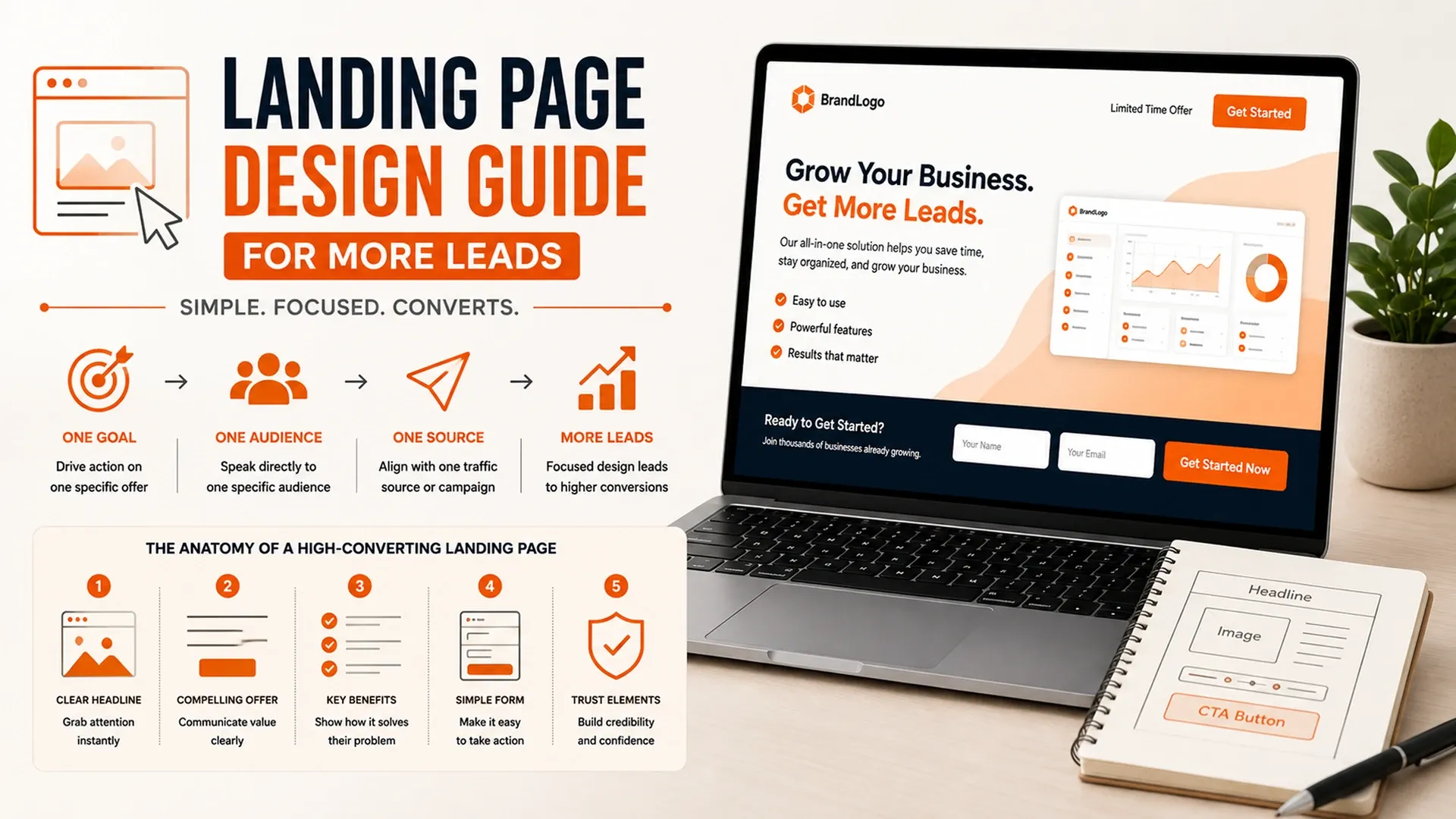
A landing page has exactly one job, which makes it one of the easiest pages to get wrong by trying to do too much. A focused landing page design guide starts from that constraint: unlike a full website, a landing page exists to serve one specific offer, for one specific audience, arriving from one specific place, which is exactly what gives it room to be more direct and more persuasive than a page trying to serve five different audiences at once.
Matching the Page to the Ad or Offer
Nothing kills conversion faster than a visitor clicking an ad and landing somewhere that doesn't feel like a continuation of what they just saw. A sound paid ads landing page strategy keeps the headline, imagery, and offer on the page consistent with whatever brought the visitor there in the first place, so nothing feels like a bait-and-switch.
- A headline that echoes the exact promise made in the ad or campaign
- One offer per page instead of several competing calls to action
- Site navigation removed or minimized so there's nowhere else to wander
- Visuals that feel like a continuation of the ad creative, not a jarring shift
Even small inconsistencies undermine that continuity - a landing page URL that doesn't resemble the domain in the ad, or a color palette that's technically on-brand but visually different from the ad creative, introduces just enough doubt to make a visitor hesitate before scrolling any further.

Writing Copy That Removes Hesitation, Not Just Sells
The best high converting landing page tips focus less on clever phrasing and more on answering the questions a visitor is silently asking - what is this, why should I trust it, and what happens after I click. Benefit-led copy above the fold, paired with testimonials, logos, or reviews placed where doubt naturally creeps in, does more to move a decision than any headline trick, a pattern conversion optimization research keeps confirming.
A short FAQ section near the bottom of the page often does more heavy lifting than an extra paragraph of persuasive copy, since it addresses the specific objections actually holding someone back instead of repeating the same benefits a third time in slightly different words.
Designing the Form Like It's the Whole Point
A lead generation landing page lives or dies by its form, so it deserves the same design attention as the headline above it. Every field that isn't strictly necessary is a small reason for someone to abandon the page, and a single obvious button beats a row of options that forces a visitor to choose, since indecision at the point of conversion is functionally the same as losing the lead entirely.
A landing page succeeds by removing every path except the one you want a visitor to take.
Testing and Iterating Instead of Guessing
No landing page gets built perfectly on the first attempt, which is why testing matters more here than almost anywhere else on a site, and why guessing which headline or image will perform better is rarely worth the risk when a structured test can answer the question directly.
- Test one variable at a time - headline, CTA, or hero image, not all three together
- Run each test long enough to reach a meaningful sample size
- Keep the losing variant's insight even when the result feels obvious
- Roll the winning version out, then start the next test
Connecting the Page to the Rest of the Funnel
A landing page rarely works in isolation - it's the handoff point between an ad campaign and everything that happens after someone submits a form. Getting the traffic there in the first place is covered in our paid advertising guide, while what happens to a lead once it's captured is the focus of our broader lead generation guide, and treating the three as one connected system tends to outperform optimizing any single piece in isolation.