Get a Quote
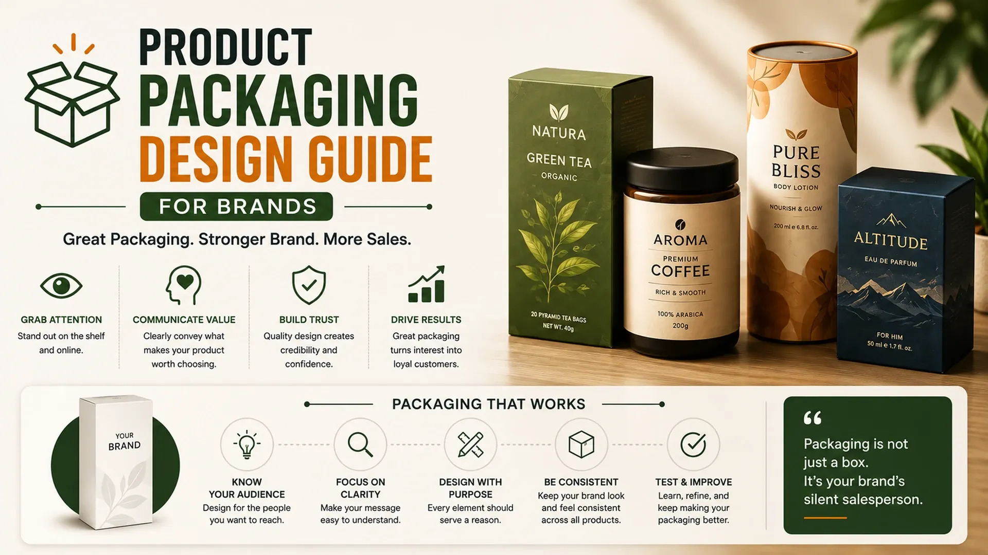
Learn how product packaging design improves brand identity, product appeal, shelf presence, ecommerce visuals, trust, and customer decisions.
A product often has to sell itself in the two or three seconds it takes a shopper's eyes to pass over a shelf, with no salesperson and no chance to explain anything. A thorough product packaging design guide treats packaging as exactly that - a silent pitch that either earns a second look or gets scrolled past, physically or online, with no second chance to make the same first impression twice.
Designing for Shelf Impact in Seconds
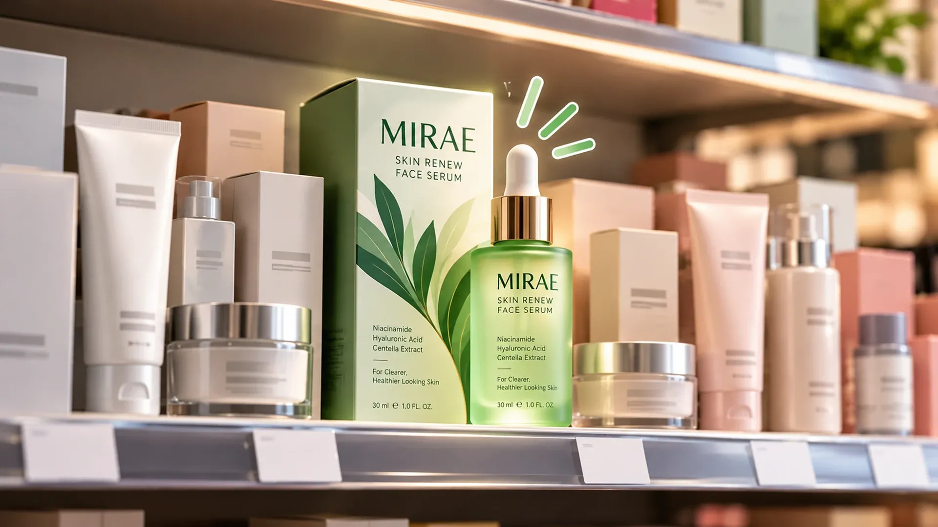
Standing out on a shelf crowded with competitors chasing the same attention is the whole challenge behind packaging design for brands, and it rarely comes down to being the loudest option. Color contrast against neighboring products, typography legible from arm's length, and a recognizable silhouette all matter more than any single clever design flourish, especially once a product sits between a dozen others fighting for the exact same half-second glance.
- Color contrast that separates the product from neighbors on the same shelf
- Typography legible from a normal shopping distance, not just up close
- A silhouette or shape that stays recognizable even in a crowded aisle
- Restraint - standing out without looking like it's trying too hard
None of that holds up if it's only ever judged on a designer's monitor - packaging needs testing under the flat, unflattering lighting of an actual store aisle and at the tiny thumbnail size it'll appear online, since both conditions flatten details that look fine at full screen brightness.
Speaking the Visual Language of the Category
Packaging expectations aren't universal - what reads as premium in one category can read as cheap in another. Solid beauty product packaging tips tend to favor restraint: clean typography, soft palettes, and visible ingredient callouts that signal quality without shouting for attention. Food product packaging design works almost in reverse, leaning on vivid imagery, appetite appeal, and the kind of nutrition labeling clarity regulators increasingly expect, cues that beauty packaging would consider too busy.
Category | Visual Priorities | Common Packaging Cues |
|---|---|---|
Beauty products | Premium, clean, minimal | Soft palettes, ingredient callouts, matte finishes |
Food products | Appetite appeal, freshness | Vivid imagery, nutrition clarity, natural cues |
Making Packaging Functional, Not Just Beautiful
Good packaging design also has to survive contact with the real world - it needs to protect the product, open without a fight, and hold up during shipping if it's ever going into a box on its way to someone's door. The unboxing moment itself has become part of the brand experience for plenty of categories, not an afterthought handled by whichever box happened to be in stock, and a design that photographs well being opened tends to earn free promotion the brand never had to ask for.
Packaging design has two audiences now - a shelf under store lighting, and a thumbnail the size of a fingertip.
Balancing the Shelf and the Screen
Brands selling in retail and online at the same time need packaging that works for both audiences, since a design built purely for physical shelf impact can look flat or illegible once it's shrunk down to a product page thumbnail. That thumbnail is often the very first thing a customer sees, which is why product photography and packaging design increasingly get planned together rather than handed to separate teams, a connection our ecommerce development guide touches on from the storefront side.
Keeping Packaging Aligned With Brand Identity
Packaging is ultimately just another surface for the brand to show up consistently, which means it should trace back to the same identity system covered in our brand strategy and identity guide, anchored by the same logo that appears everywhere else the brand does. Getting that consistency right turns packaging into free advertising every time a customer picks the product back up.