Get a Quote
Learn core UI/UX design principles for product usability, user journeys, wireframes, accessibility, conversion design, and digital experiences.
Design trends change every few years, but the underlying UI UX design principles behind genuinely usable products barely move at all. They're less about what's currently fashionable and more about how people actually perceive, decide, and act — which is exactly what makes them worth understanding on their own, separate from any specific process or tool.
Visual Hierarchy Tells Users What Matters First
Size, weight, color, and placement all signal importance before a user reads a single word, which means hierarchy either does that job deliberately or does it by accident:
- The single most important action on a screen should be the most visually dominant
- Secondary actions stay visible but clearly subordinate, not competing for attention
- Text hierarchy mirrors reading order, not just visual preference
- Whitespace is used to separate ideas, not just to fill empty space
Consistency Removes the Need to Relearn
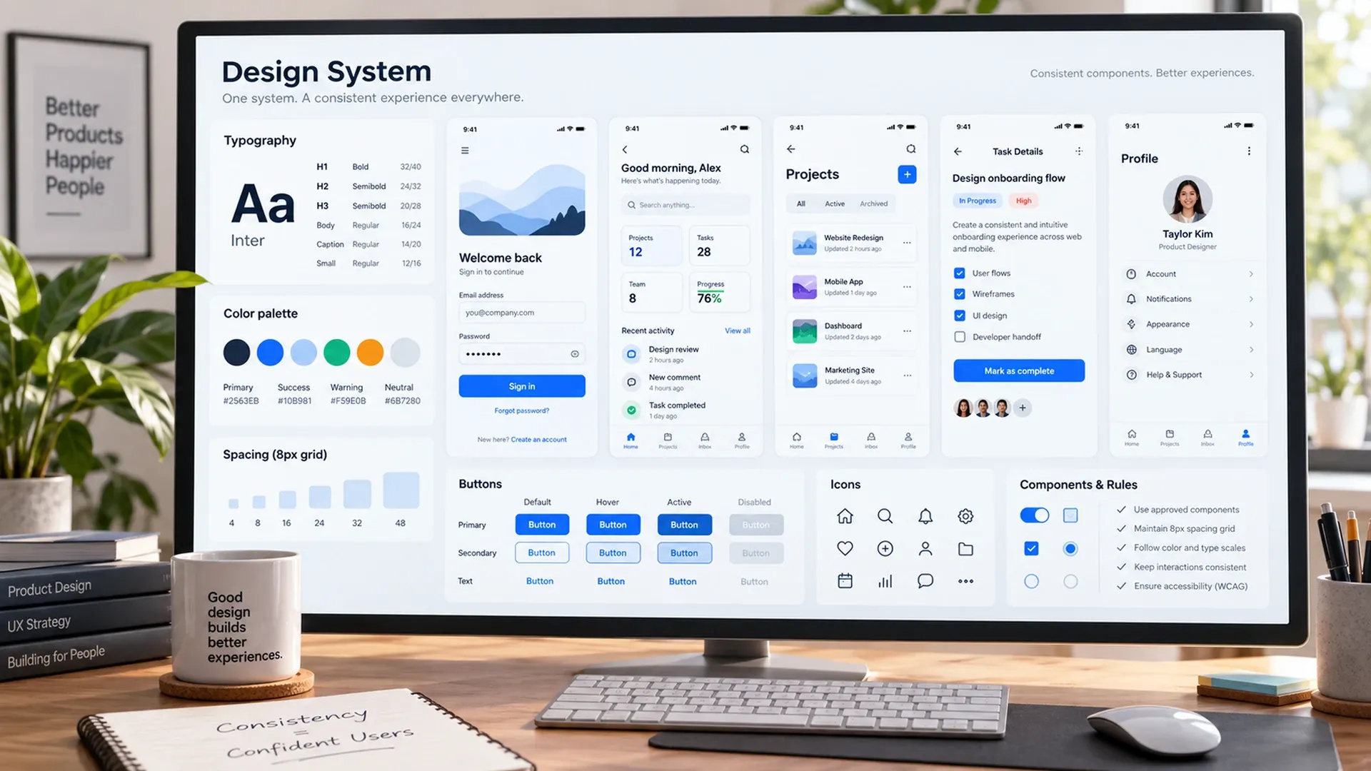
Every inconsistency in a product — a button that looks different depending on the screen, an icon that means one thing here and something else there — forces a user to re-learn something they thought they already understood. Consistent patterns let familiarity transfer from one part of a product to another, which is why a well-designed system often feels intuitive on a screen a user has never actually seen before. A documented design system makes this consistency durable across a team, rather than dependent on everyone remembering the same unwritten rules.
Grouping Related Things So the Brain Doesn't Have To
Items placed close together get perceived as related, whether or not that was the intent — a principle Nielsen Norman Group's writing on Gestalt principles has documented extensively in interface design. Deliberate proximity groups a label with its input, related settings under one heading, and an action button next to the content it affects, so a layout communicates structure before a user has to work it out.
Giving Feedback for Every Action a User Takes
A button that gives no visible response after being clicked leaves a user uncertain whether anything happened at all, which is often enough to make them click again or abandon the flow entirely. A loading state, a confirmation message, or even a subtle animation all close that gap between action and acknowledgment.
Silence, in an interface, always reads as something being broken — even when it isn't.
Reducing Cognitive Load Wherever Possible
Every extra decision a screen asks a user to make is a small tax on their attention, and one of the most reliable core UX design principles is simply removing decisions that don't need to exist. Smart defaults, progressive disclosure of advanced options, and breaking a complex task into smaller steps all reduce the mental effort required to get from intent to action. A form that asks for ten fields upfront feels heavier than the same ten fields spread thoughtfully across three short steps, even though the total effort is identical.
Using Color and Contrast as Functional Tools
Color communicates state, hierarchy, and meaning long before a user consciously registers it, which is why treating it purely as decoration misses half of what it does. Solid product design best practices use contrast intentionally — enough to distinguish interactive elements from static ones, and enough to remain legible for users with low vision, not just enough to look clean on a design file.
None of these principles are new, and that's exactly the point — hierarchy, consistency, grouping, feedback, reduced cognitive load, and functional color have outlasted every specific design trend built on top of them. Genuinely user-centered design tips tend to trace back to one of these fundamentals rather than a clever one-off idea. For how these principles translate into an actual design process, our UI/UX design guide covers journey mapping, prototyping, and testing in more depth — and once a design is validated, our frontend development guide covers turning it into a real product.