Get a Quote
Learn how UI/UX design improves usability, product clarity, user journeys, wireframes, prototypes, conversions, and customer experience.
Good UI/UX design rarely gets noticed — and that's the point. When an interface works well, users move through it without friction, understanding what to do next almost automatically. When it doesn't, every extra click, unclear label, or confusing screen chips away at trust and, eventually, conversions. Strong design isn't about decoration; it's about removing the obstacles between a user's intent and the action they came to take, and it only pays off once it's carried faithfully into real frontend development.
Mapping the User Journey Before Designing Screens
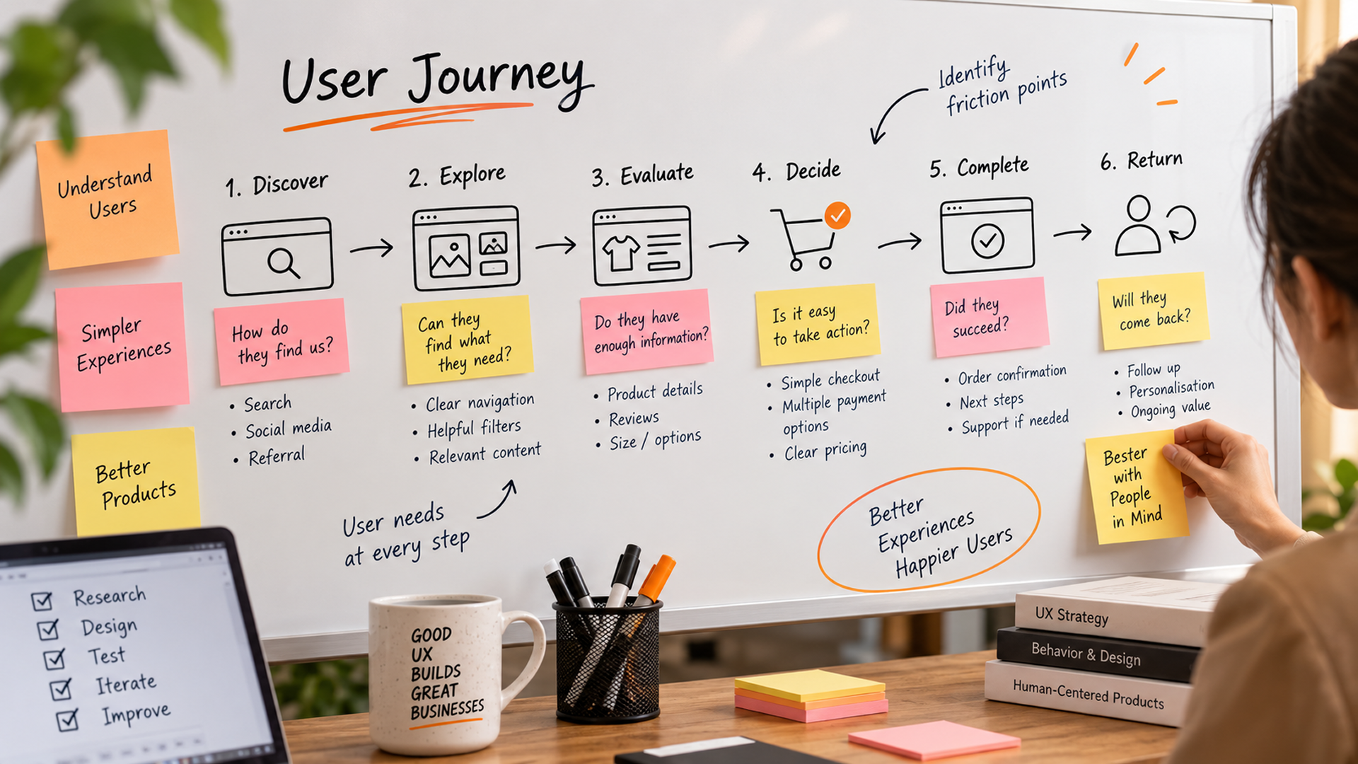
Before any screens get designed, thoughtful user experience design starts by mapping out the actual journey a user takes — from the moment they land on a product to the action that matters most, whether that's signing up, booking, or completing a purchase. This journey mapping surfaces friction points that aren't obvious when looking at individual screens in isolation: a confusing step buried three pages in, a missing piece of information, or a form that asks for too much too soon. Starting with the journey, rather than jumping straight into visuals, keeps design decisions grounded in how people actually move through a product.
From Wireframes to Prototypes
Design typically moves through a few distinct stages, each clarifying a different question before real effort goes into visuals:
- Wireframes define structure and layout before any visual styling
- Prototypes simulate real interactions to test flows before development
- Visual design applies brand identity, color, and typography once structure is confirmed
- User testing validates whether the design actually works as intended
Skipping straight to polished visuals without this groundwork often means expensive rework later, once structural problems surface in development or, worse, after launch.
Small Details That Shape Conversion
Conversion-focused UI UX lives in the details: how clearly a button communicates what happens next, how obvious an error message is when something goes wrong, or how much effort a form appears to require before someone starts filling it in. None of these details are dramatic on their own, but together they determine whether a user feels confident moving forward or hesitates and leaves.
Good UX doesn't try to impress users with cleverness — it tries to make the right next step feel obvious.
Designing for Accessibility From the Start
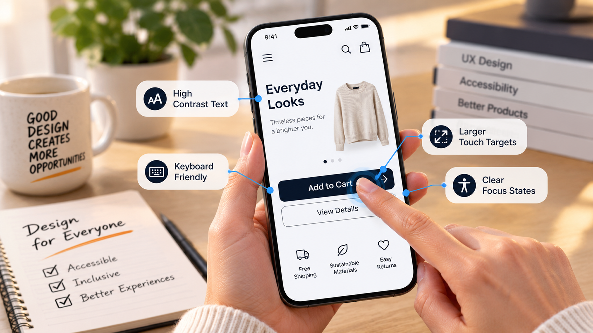
Accessible design is frequently treated as a separate checklist added near the end of a project, but the strongest UX outcomes come from considering it alongside every other decision, guided by practical resources like the A11Y Project. A product designed with sufficient color contrast — a 4.5:1 ratio for standard text, per WCAG — clear focus states, and logical tab order tends to be easier for every user to navigate, not just those relying on assistive technology. Retrofitting accessibility into a finished design is far more disruptive than designing for it from the first wireframe, since structural decisions made early — like how a form is laid out or how navigation is organized — are exactly the ones that are hardest to change later.
Validating Design Decisions With Real Users
Even experienced design teams make assumptions that don't hold up once real users interact with a product. Usability testing — watching someone unfamiliar with a design try to complete a task — routinely surfaces confusion that internal reviews miss entirely, simply because the people building a product already understand it too well to notice where it's unclear. Testing doesn't need to be elaborate or expensive to be useful; even a handful of short sessions with representative users, run before development is finished, can catch problems while they're still cheap to fix.
UI/UX design succeeds when it removes friction rather than adding visual complexity. By mapping the user journey first, moving deliberately from wireframes to tested prototypes, designing for accessibility from the outset, and validating decisions with real users, businesses can build digital products that feel simple to use — and convert because of it. Our frontend development guide covers the other half: turning these designs into a fast, working product.