Get a Quote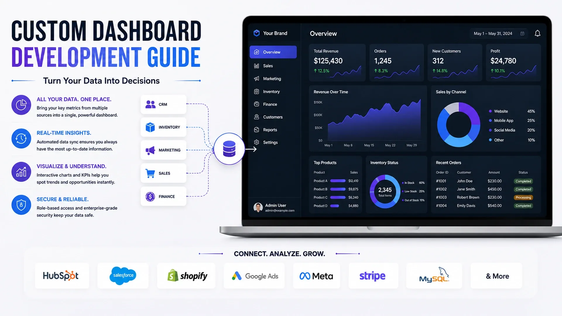
Learn how custom dashboards help businesses track KPIs, sales, operations, analytics, CRM activity, reports, and decision-making.
Most businesses aren't short on data - they're short on a single place to look at it. Sales numbers live in a CRM, stock levels live in an inventory tool, and marketing performance lives in three different ad platforms. A useful custom dashboard development guide starts by treating that scattering as the actual problem to solve, not the dashboard's visual design, since the prettiest chart in the world is worthless if it's built on numbers pulled by hand once a week.
Deciding What KPIs Actually Belong on the Dashboard
The instinct when building a dashboard is to show everything the underlying systems can technically report, which usually produces a screen nobody actually checks. Careful KPI dashboard development starts from the decisions a team needs to make day to day, then works backward to the handful of numbers that genuinely inform those decisions.
- Metrics tied to a specific decision someone actually makes, not just interesting data
- A small enough set of KPIs that the dashboard gets checked daily, not ignored
- A clear owner for each metric so nobody assumes someone else is watching it
- A refresh cadence that matches how fast the underlying number actually changes
The instinct to add just one more metric is worth resisting deliberately. A dashboard that tries to be comprehensive usually ends up being comprehensive to nobody, since each additional card dilutes the attention any single number actually gets from the people looking at it.
Pulling Data From Every System Into One View
Good business dashboard tips rarely start with charts at all - they start with plumbing. Sales figures, inventory counts, and support tickets all live in different systems by default, and a dashboard is only useful once those systems are actually feeding it reliably rather than requiring someone to export a spreadsheet every Monday morning and paste it into a slide deck nobody reads past the first two rows.
That plumbing work overlaps heavily with two other systems worth reading about together: a CRM is usually the richest source of sales and pipeline data a dashboard displays, while the connections themselves come down to the same fundamentals our API integration guide covers.
Refresh frequency deserves its own decision too - a sales pipeline view might need to update within minutes, while a quarterly trend chart is just as useful refreshed once a day. Treating every metric as equally urgent tends to overload the systems feeding the dashboard for no real benefit.
A dashboard is only as trustworthy as the systems quietly feeding it data.
Designing for Clarity, Not Just Charts
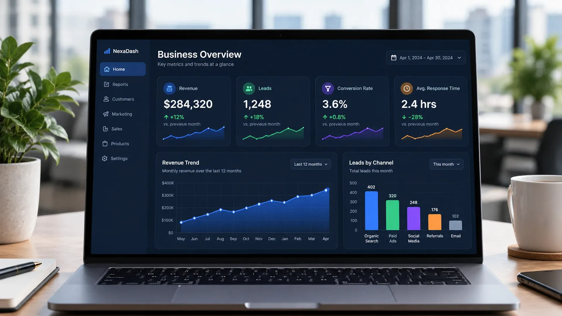
Once the right numbers are flowing in, a sound analytics dashboard strategy is mostly about restraint - grouping related metrics together, using charts that match the type of data instead of defaulting to a bar chart for everything, a habit usability research consistently flags as a readability problem, and leaving enough visual breathing room that a manager can scan the screen in under a minute, ideally without needing a legend to remember what each color represents.
Color choice matters more than it gets credit for. Using red and green purely as decoration, rather than reserved for genuine alerts and successes, trains people to tune out the exact signals a dashboard exists to surface in the first place.
Giving Different Teams the Right Level of Access
Not every dashboard user needs to see the same thing - a warehouse lead cares about stock movement the way a sales manager cares about pipeline, and role-based views keep each team looking at what's relevant instead of scrolling past sections meant for someone else. Businesses tracking physical stock alongside sales performance often find their inventory management system is the other half of this same dashboard, not a separate project, and building both around the same underlying data model avoids duplicating effort twice over.