IM Digital crafted a conversion-focused UI/UX for Movara Physio, a physiotherapy and rehabilitation clinic, covering service discovery, condition-based content, and appointment booking flows.
Project Name
Movara Physio
Industry
Healthcare - Physiotherapists
Category
Branding & Design
Services
UI/UX Design
Project Overview
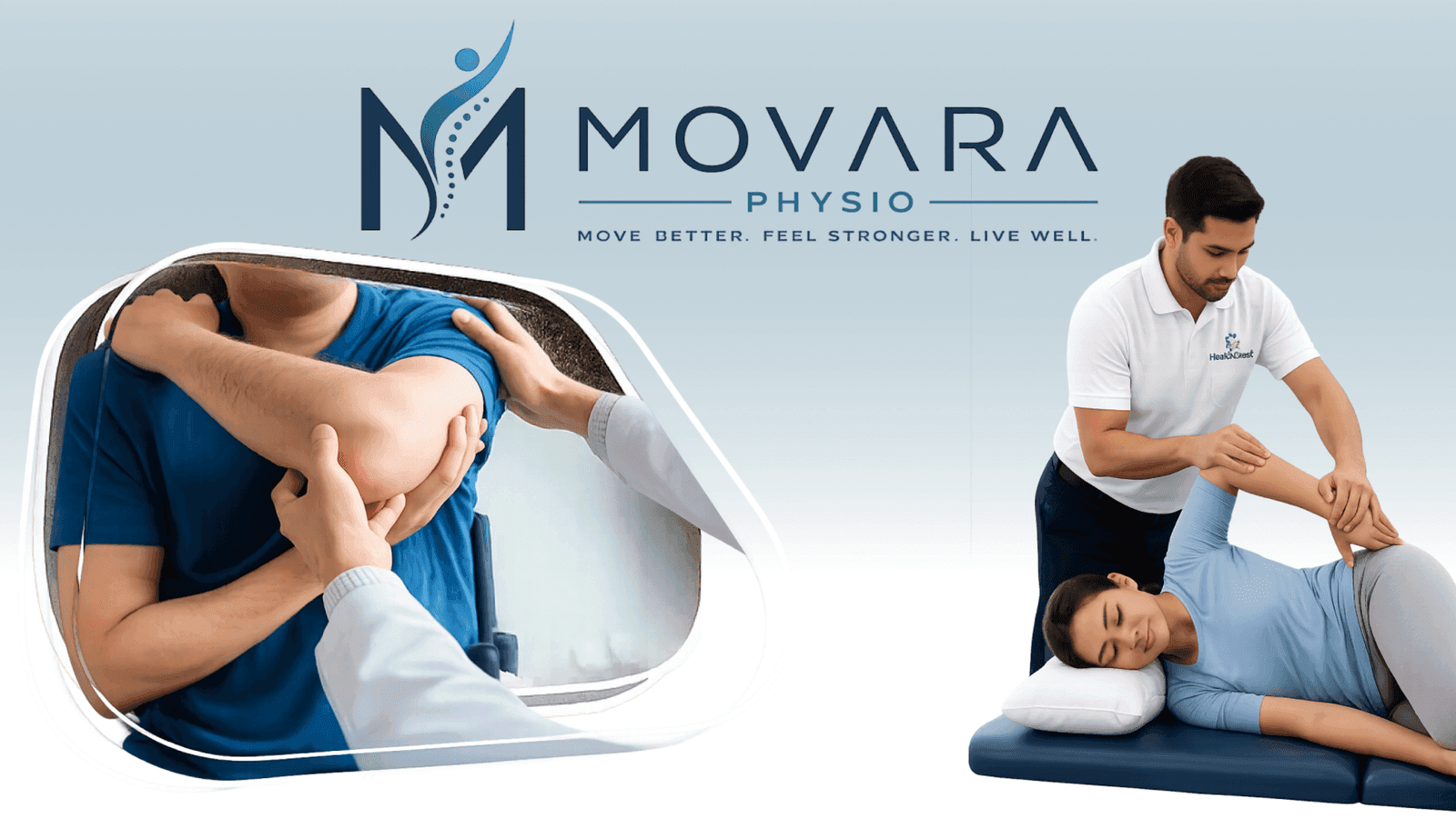
Movara Physio is a premium physiotherapy and rehabilitation clinic in Midtown East, New York, helping patients recover from injuries, surgeries, and chronic pain through evidence-based, technology-driven care. IM Digital was engaged to design the clinic's complete website UI/UX, turning services, treatable conditions, and the recovery process into a clear, reassuring digital experience. Working from Movara's navy and medical blue identity, we designed every key journey, from finding the right service and reading condition-specific content to booking an appointment and checking insurance coverage, so anxious, pain-driven patients feel confident before they ever walk through the door.
Project Summary
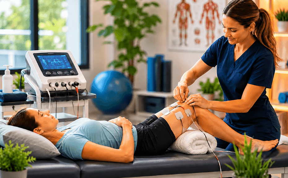
IM Digital designed Movara Physio's website UI/UX end to end, shaping service discovery, condition-specific content, and appointment booking flows for the rehabilitation clinic and its patients.
Movara Physio wanted a website that felt as trustworthy and reassuring as its in-clinic care, capable of converting anxious, pain-driven visitors into booked appointments. The goal was a UI/UX that clearly explains services and treatable conditions, walks patients through the recovery process step by step, builds credibility through the team and outcomes, and makes booking an appointment effortless.
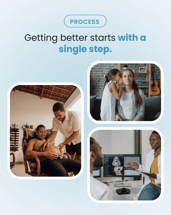
We studied Movara's core patients, neck pain sufferers, athletes, post-surgical patients, and seniors, mapping their concerns to define the journeys the new interface had to support.
We structured the sitemap around services and treatable conditions, so patients in pain find relevant information and next steps within just a few clear, reassuring clicks instead of digging.
We designed a calm, professional interface using Movara's navy and medical blue palette with Montserrat and Inter typography, styled around real clinic photography, outcomes, and measurable results.
We designed a simple appointment booking flow alongside clear insurance and payment information, removing friction for patients finally ready to schedule their very first clinic visit.
Service Delivered
IM Digital delivered complete UI/UX design for Movara Physio, covering the homepage, services, conditions, team, and booking sections, all built as one consistent, trust-driven design system.

Service Showcase
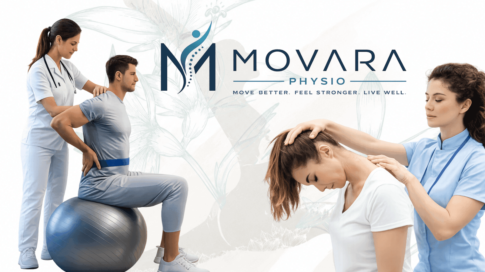
The showcase highlights Movara's reassuring hero banner, condition-based service grids, and step-by-step recovery journey, reflecting a premium rehabilitation clinic across every touchpoint.
Whether you need scalable software development, AI integration, SEO optimization, or complete digital transformation, our team is ready to help your business grow globally.
Business Challenge
Movara Physio needed a website that could calm anxious, pain-driven visitors while clearly guiding them toward the right service. Its offering spanned musculoskeletal, sports, neurological, and post-surgical physiotherapy, each needing distinct, condition-specific content without overwhelming first-time visitors already in discomfort. Patients ranged from office workers with neck pain to athletes recovering from injury to seniors needing balance training, each expecting different reassurance. The site also had to explain the multi-step recovery process clearly, build credibility through the clinical team, and make booking an appointment feel effortless rather than administrative.
Most physiotherapy websites default to dense clinical text, making it hard for pain-driven, anxious visitors to quickly find the reassurance and information they actually need before booking.
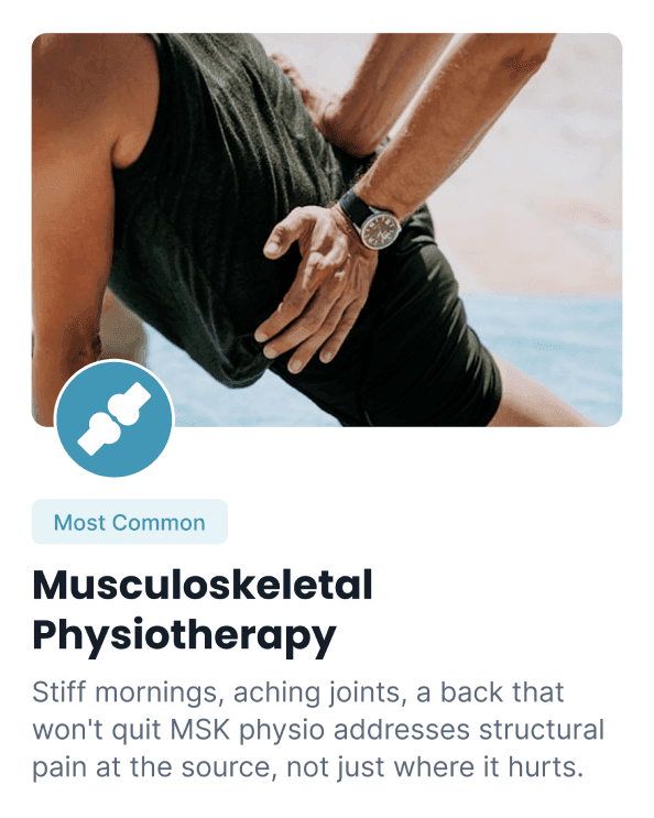
Musculoskeletal, sports, neurological, and post-surgical physiotherapy each needed distinct, condition-specific content, without overwhelming visitors already searching in discomfort.
Office workers with neck pain, athletes recovering from injury, and seniors needing balance training all arrive with very different needs on the exact same clinic website every single day.
Patients needed a clear picture of what treatment actually involves, from assessment to long-term wellness, before they felt confident enough to book with a clinic they had never visited.
A complicated or purely administrative booking flow risked losing patients at the final step, right when they were closest to finally scheduling their very first visit with the clinic.
Strategic Approach
IM Digital built Movara's interface on a calm, clinical visual language, pairing signature navy and medical blue tones with clean Montserrat headings and Inter body text. Navigation was organized around services and treatable conditions, so patients in pain reach relevant information quickly regardless of their entry point. A clear, five-step recovery journey visualization walked visitors from assessment to long-term wellness, demystifying treatment before they ever booked. Trust indicators, patient outcomes, and team credentials were placed prominently to build confidence, while a simplified booking flow with visible insurance information removed friction at the final, most important step.
We built a reassuring visual system from Movara's signature navy and medical blue palette, combining Montserrat and Inter typography so every screen feels professional, calm, and trustworthy rather than clinical and cold.
The information architecture is organized around services and treatable conditions, letting patients in pain reach relevant information and next steps quickly instead of searching through generic clinic pages.
A clear, five-step recovery journey from assessment to long-term wellness was visualized prominently, demystifying treatment and building patient confidence before they ever booked their first appointment.
Patient outcomes, satisfaction rates, and team credentials were placed prominently across key pages, giving anxious visitors the social proof and clinical credibility needed to feel confident booking.
We simplified the appointment booking flow and surfaced insurance and payment information clearly, removing friction at the exact moment patients were ready to book their first visit, turning interest into a confirmed appointment.
Result
The redesigned UI/UX turned Movara's website into a genuine booking engine, lifting appointment requests, condition page engagement, and overall patient trust within just a few months.
+50%
Appointment Bookings
+55%
Condition Page Views
+40%
Patient Inquiries
+35%
Session Duration
Whether you need scalable software development, AI integration, SEO optimization, or complete digital transformation, our team is ready to help your business grow globally.
Explore more software, AI, SEO, and digital marketing projects where we've helped brands achieve real, measurable growth.
IM Digital designed a clinical, trustworthy logo for Movara Physio, translating movement and recovery into one versatile mark used across signage, digital, and print materials patients see daily.
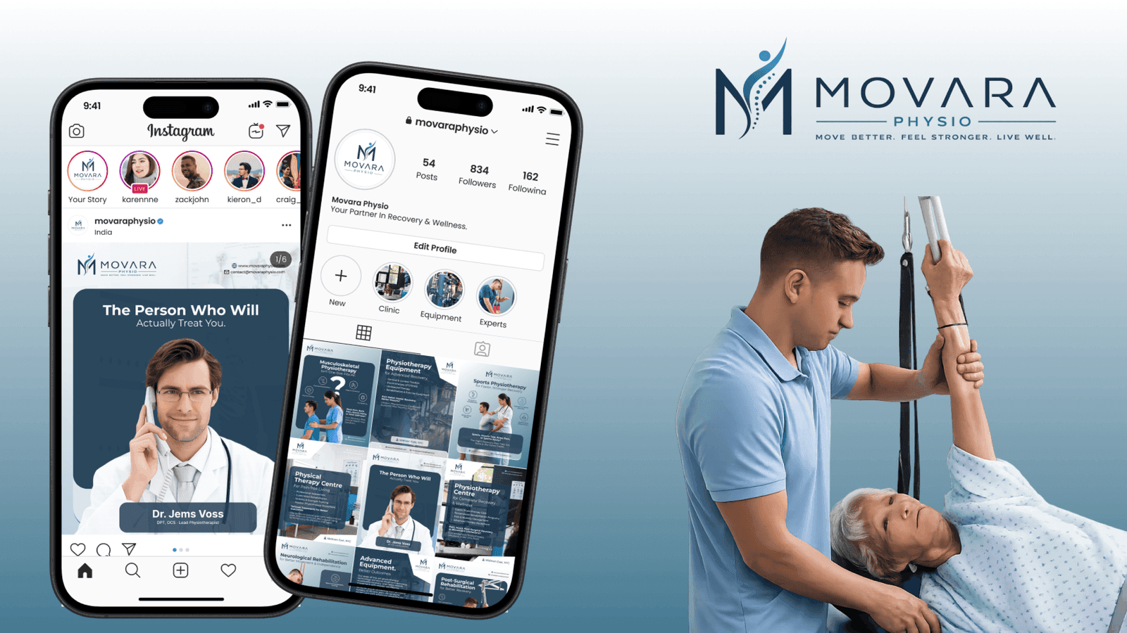
IM Digital runs Movara Physio's social media strategy, turning injury prevention tips, recovery stories, and clinic updates into engaging content across Instagram, Facebook, and LinkedIn.
IM Digital built Movara Physio's brand strategy and identity system, defining positioning, voice, patient personas, color palette, and typography for a consistent, trusted clinic brand.
Browse our complete portfolio of digital work across every industry we serve.
Explore Our WorkA physiotherapy clinic's website should include clear service and condition pages, a step-by-step explanation of the recovery process, visible team credentials and patient outcomes, and a simple appointment booking flow. Movara Physio's redesign organized these elements around musculoskeletal, sports, neurological, and post-surgical conditions so pain-driven visitors reach relevant answers within a few clicks.
After restructuring its site around condition-based navigation, a five-step recovery journey, and a simplified booking flow with visible insurance details, appointment bookings jumped 50% for Movara Physio. Removing friction at the final step, where anxious patients previously abandoned complicated forms, also lifted condition page views 55% and patient inquiries 40%.
Most healthcare websites bury patients in generic, dense clinical text, which is exactly why condition-specific content matters: it helps visitors already in pain or discomfort find relevant answers fast. Movara Physio structured pages around musculoskeletal, sports, neurological, and post-surgical conditions so Physiotherapists and their patients reach the right information within a few clicks.
Balancing clinical credibility with human warmth is the toughest UX challenge, since pain-driven visitors need reassurance before they can absorb dense treatment information. Movara Physio's site had to serve office workers with neck pain, recovering athletes, and seniors needing balance training on identical pages, so the interface relied on condition-first navigation and a calm navy and medical blue palette.
Start with patient-led discovery, mapping your core patients, their concerns, and the journeys your interface must support, exactly how Movara Physio's redesign began before any screens were drawn. From there, condition-based architecture, a calming visual system, and a frictionless booking flow come together. Contact the team to discuss a UI/UX plan built around your clinic's actual patients.

 Get a Quote