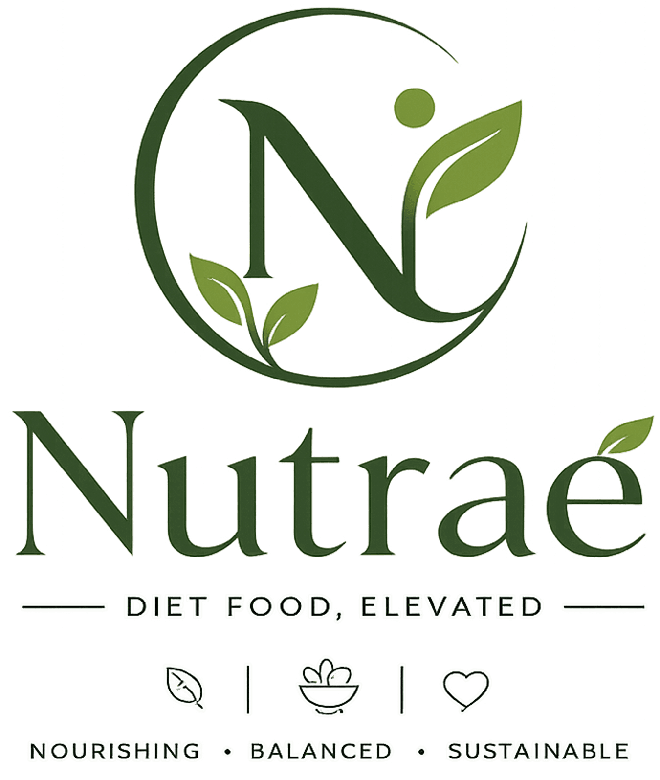
IM Digital designed a minimalist, premium logo for Nutraé, balancing culinary warmth and nutritional credibility into one versatile mark used across packaging, app, and delivery boxes.
Project Name
Nutraé
Industry
Food - Diet Food Brands
Category
Branding & Design
Services
Logo Design
Project Overview
Nutraé needed a logo capable of carrying its full brand story: premium enough for restaurant-quality meals, credible enough to suggest real nutritional science, and warm enough to feel approachable for everyday healthy eating. IM Digital led the logo design process, exploring organic, minimalist marks built around circular forms and leaf motifs that reflected nature, wellness, and balance. The final mark stayed flexible enough to work across delivery packaging, the website, the mobile app, and social profiles. The result combines clean, modern letterforms with natural symbolism, giving Nutraé a distinct, recognizable identity that anchors every brand touchpoint.
Project Summary
IM Digital designed Nutraé's primary logo mark, exploring organic, minimalist typography that balances culinary premium cues with nutritional credibility across every brand application.
Nutraé needed a logo that could sit convincingly between restaurant-quality dining and personalized nutrition without feeling like either extreme alone. The goal was a clean, minimal, and versatile mark rooted in nature and wellness symbolism that worked across delivery packaging, digital platforms, and print, giving every future brand asset a strong, recognizable anchor to build from.
We studied Nutraé's positioning between culinary passion and nutritional science, translating that concept into initial directions for symbolism, typography, and overall logo personality.
We explored multiple organic, minimalist concepts built around circular forms and leaf motifs, testing how each balanced premium, clinical, and natural cues before narrowing the direction.
We refined the selected concept's letterforms, spacing, and proportions, testing legibility and impact at different sizes before finalizing the primary logo mark and its variations.
We tested the finished logo across packaging mockups, the website, the mobile app, and delivery boxes, confirming it stayed sharp, balanced, legible, and recognizable in every format.
Service Delivered
IM Digital delivered Nutraé's primary logo, alternate lockups, and a usage-ready file set, giving the brand one consistent, versatile mark across packaging, digital, and print applications.
Service Showcase
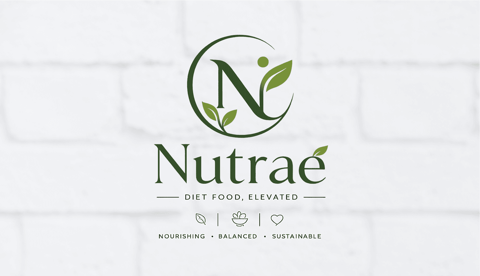
The showcase features Nutraé's primary logo lockup, icon-only mark, and packaging and app applications, demonstrating consistency across every format, size, color, and background used.
Whether you need scalable software development, AI integration, SEO optimization, or complete digital transformation, our team is ready to help your business grow globally.
Business Challenge
Nutraé's brand identity needed to sit between culinary indulgence and nutritional science at once, without feeling like a compromise between the two. As a cloud kitchen brand new to market, Nutraé had no existing visual equity to build from, so the logo alone had to establish instant credibility and appetite appeal together. It also needed to work everywhere the brand appears, delivery packaging, app icons, social avatars, and printed collateral, without losing clarity or impact. On top of that, the mark had to feel timeless rather than trend-driven, since food packaging and branding are expected to last for years without a redesign.
As a cloud kitchen brand entirely new to market, Nutraé had no established visual identity to build from, meaning the logo alone had to create instant recognition and lasting credibility.
The mark had to feel appetizing and premium while still suggesting real nutritional science, without leaning so far into either direction that it lost the other completely and felt one-note.
The logo needed to stay clear and impactful on delivery packaging, app icons, social avatars, and printed materials, across very different sizes, backgrounds, and physical formats.
Food packaging and branding are expected to last for years without a refresh, so the mark had to feel timeless and enduring rather than tied to a passing, short-lived design trend.
The logo needed to visually reflect nature, wellness, and balance in a distinctive way, rather than being a generic, interchangeable mark used across the diet food delivery industry.
Strategic Approach
IM Digital approached Nutraé's logo through organic, minimalist design, combining a circular form and leaf motif with clean typography to suggest nature, wellness, and balance at once. We explored directions rooted in the brand's culinary and nutritional dual identity, refining proportions until the mark felt equally at home on a delivery box and a nutrition label. Every version was tested at extreme sizes, from a small app icon to large packaging, to confirm it stayed sharp and legible everywhere. The result is a flexible, distinct mark that anchors Nutraé's olive green and cream identity across every future application.
We built the mark around a circular form and leaf motif paired with clean typography, letting natural symbolism carry the premium feel instead of relying on decorative elements that age quickly or feel dated.
Concepts were developed to sit equally between culinary appeal and nutritional credibility, giving the final mark a distinct, ownable story rather than a generic, interchangeable wellness brand look overall.
We refined proportions and detailing until the logo felt equally credible on a delivery box and a nutrition label, bridging appetite appeal and scientific trust together in one single, cohesive, unified mark.
The mark was tested from small app icons up to large packaging and delivery signage, confirming it stayed sharp, balanced, legible, and instantly recognizable at every possible size, format, and background.
We delivered primary, alternate, and icon-only lockups so Nutraé's team could apply one consistent mark across packaging, the app, and print, without ever compromising clarity or brand recognition anywhere.
Result
The new mark gave Nutraé instant visual consistency across packaging, app, and print, strengthening brand recognition and giving every other design decision a clear anchor to build from.
+50%
Brand Recognition
+35+
Packaging SKUs
4
Platforms Rebranded
-30%
Approval Turnaround
Whether you need scalable software development, AI integration, SEO optimization, or complete digital transformation, our team is ready to help your business grow globally.
Explore more software, AI, SEO, and digital marketing projects where we've helped brands achieve real, measurable growth.
IM Digital crafted a conversion-focused UI/UX for Nutraé, a premium healthy meal delivery brand, covering goal-based meal plans, menu discovery, subscriptions, and a frictionless ordering flow.
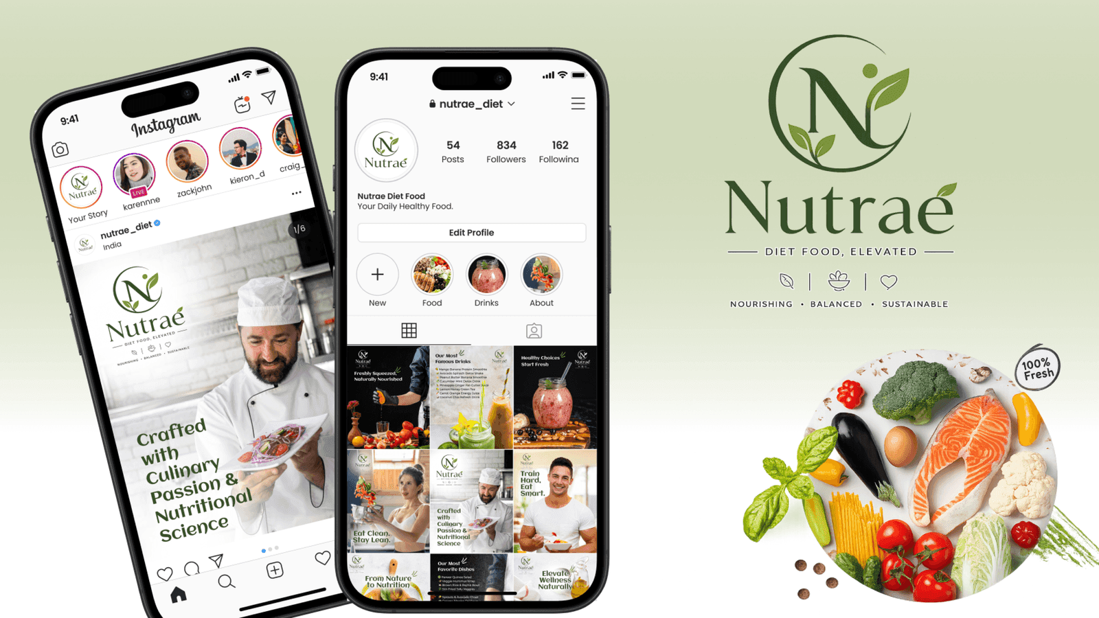
IM Digital runs Nutraé's social media strategy, turning chef-crafted meals, nutrition education, and transformation stories into engaging content across Instagram, Facebook, and TikTok.

IM Digital built Nutraé's brand strategy and identity system, defining positioning, voice, personas, color palette, and typography for a consistent, premium wellness food delivery brand.
Browse our complete portfolio of digital work across every industry we serve.
Explore Our WorkA strong logo for a food or meal delivery brand needs to feel appetizing and credible at once, without leaning so far into either quality that it loses the other. Nutraé's mark combined a circular form and leaf motif with clean typography via Logo Design, balancing culinary warmth with the nutritional science behind every meal plan.
Brand recognition rose 50% after Nutraé introduced a single consistent mark across packaging, its app, and social profiles. As a cloud kitchen with no existing visual equity to build from, the new organic, minimalist logo gave the previously unbranded startup an instantly recognizable identity across more than 35 packaging SKUs and four rebranded platforms.
Most wellness and nutrition brands choose minimalist marks because clean forms stay legible at every size, from a small app icon to large delivery packaging. Nutraé's circular form and leaf motif reflect nature and balance without decorative details that age quickly, keeping the logo timeless rather than tied to a passing design trend.
Designing a multi-format logo requires testing the mark at extreme scales before finalizing it. Nutraé's logo was tested from small app icons up to large delivery signage, confirming it stayed sharp and legible everywhere, then rolled out across primary, alternate, and icon-only lockups for consistent use across packaging, the app, and social media.
IM Digital begins every logo design project by researching what the brand needs to communicate before exploring a single concept. For Nutraé, that meant balancing culinary indulgence with nutritional credibility through circular, leaf-inspired forms. Contact us to start a logo design process built around your own food brand's positioning.

 Get a Quote