IM Digital designed a minimalist, premium logo for Mirae Skincare, balancing luxury and clinical cues into one versatile mark used across packaging, website, social profiles, and print.
Project Name
Mirae
Industry
Beauty - Natural Skincare Brands
Category
Branding & Design
Services
Logo Design
Project Overview
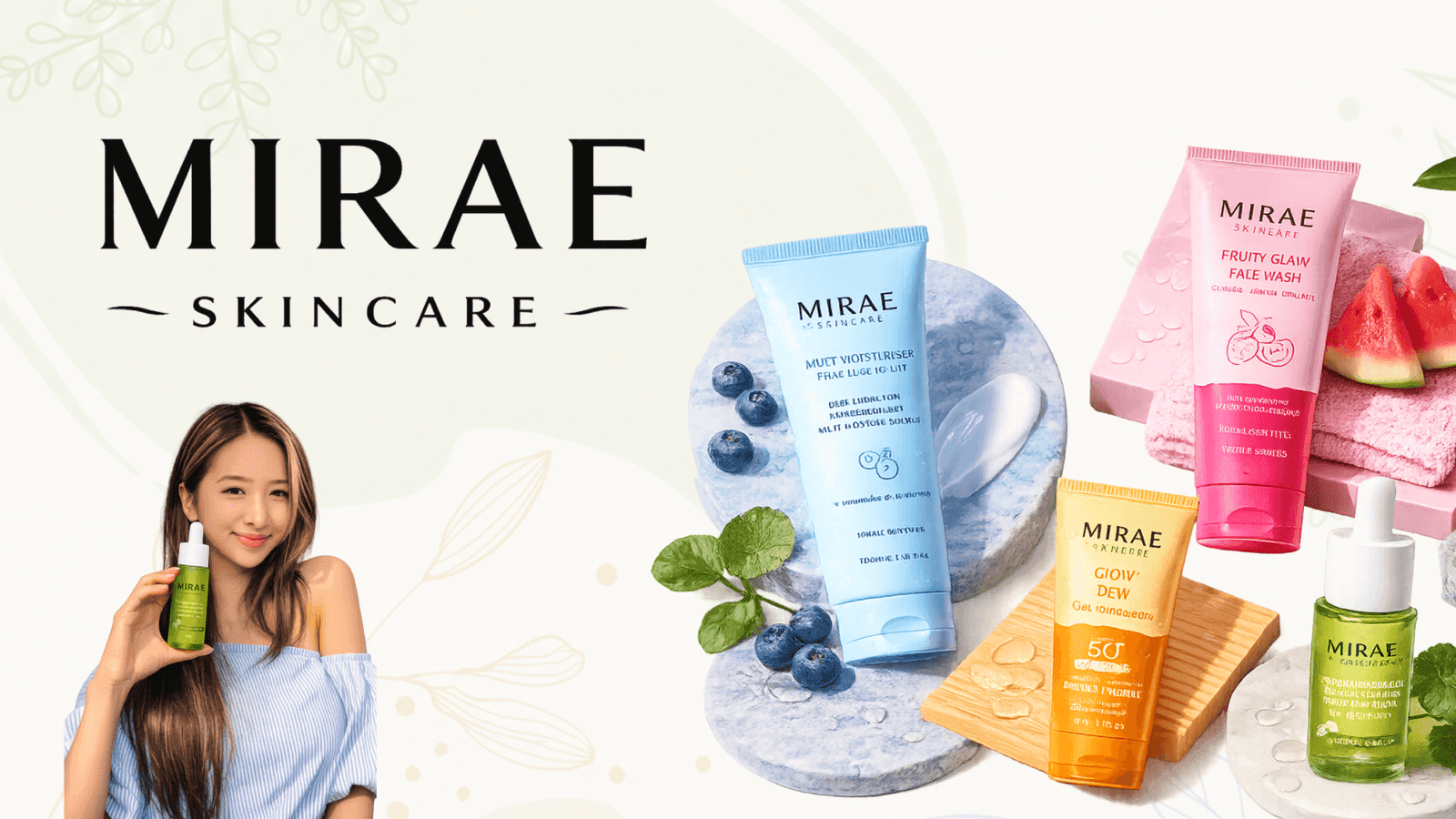
Mirae Skincare needed a logo capable of carrying its full brand story: premium enough for luxury skincare shelves, credible enough to suggest real dermatological science, and warm enough to feel approachable to everyday customers. IM Digital led the logo design process, exploring minimalist typographic marks that reflected the meaning behind 'MIRAE,' future beauty and transformation, while staying flexible enough to work across packaging, the website, social profiles, and print materials. The final mark combines clean, modern letterforms with subtle refinement, giving Mirae a distinct, recognizable identity that anchors every other brand touchpoint.
Project Summary
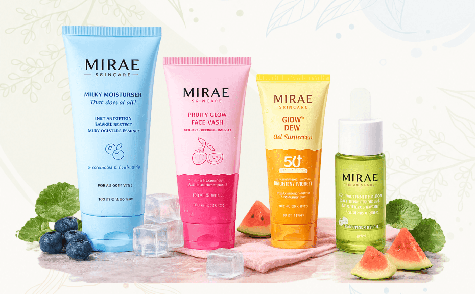
IM Digital designed Mirae Skincare's primary logo mark, exploring minimalist typography that balances luxury positioning with clinical credibility across packaging, digital, and print applications.
Mirae needed a logo that could sit convincingly between luxury skincare, clinical skincare, and modern beauty brands without feeling like any one category alone. The goal was a clean, minimal, and versatile mark that reflected the brand's meaning, future-focused transformation, worked across packaging, digital platforms, and print, and gave every future brand asset a strong, recognizable anchor to build from.
We studied the meaning behind 'MIRAE,' future beauty and transformation, translating that concept into initial directions for typography, mark style, symbolism, and overall logo personality.
We explored multiple minimalist typographic concepts, testing how each balanced luxury, clinical, and modern beauty cues, before narrowing in on the strongest, most distinctive direction for Mirae.
We refined the selected concept's letterforms, spacing, and proportions, testing legibility and impact at different sizes before finalizing the primary logo mark and its variations.
We tested the finished logo across packaging mockups, the website, social profiles, and print materials, confirming it stayed sharp, balanced, legible, and recognizable in every format.
Service Delivered
IM Digital delivered Mirae's primary logo, alternate lockups, and a usage-ready file set, giving the brand one consistent, versatile mark across packaging, digital, and print applications.
Service Showcase
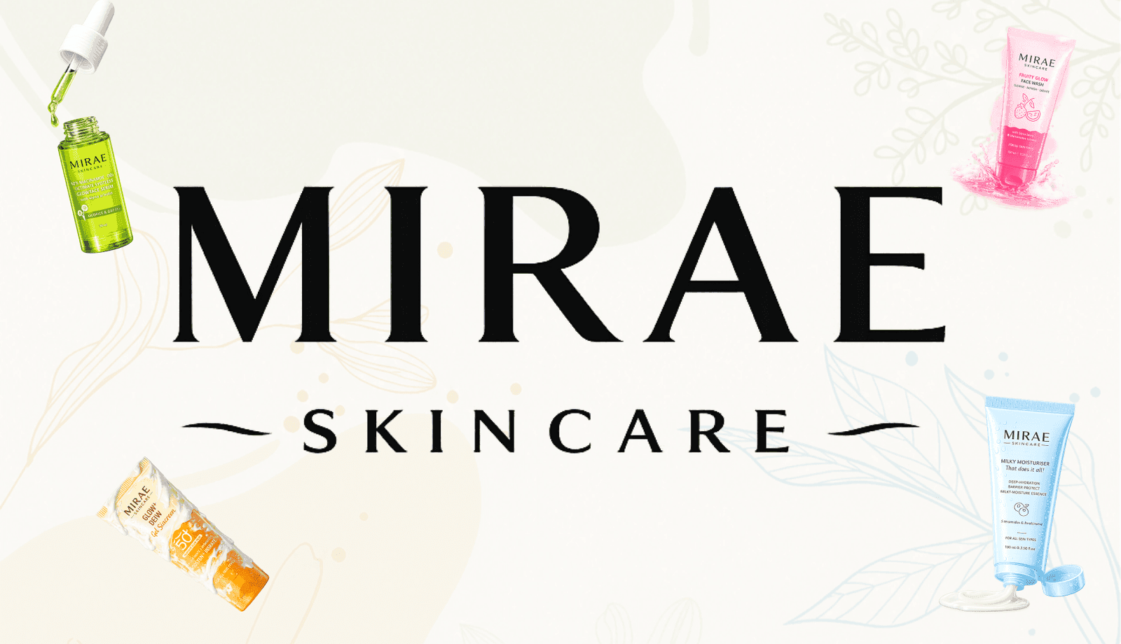
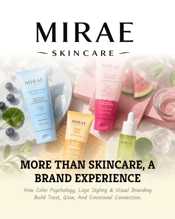
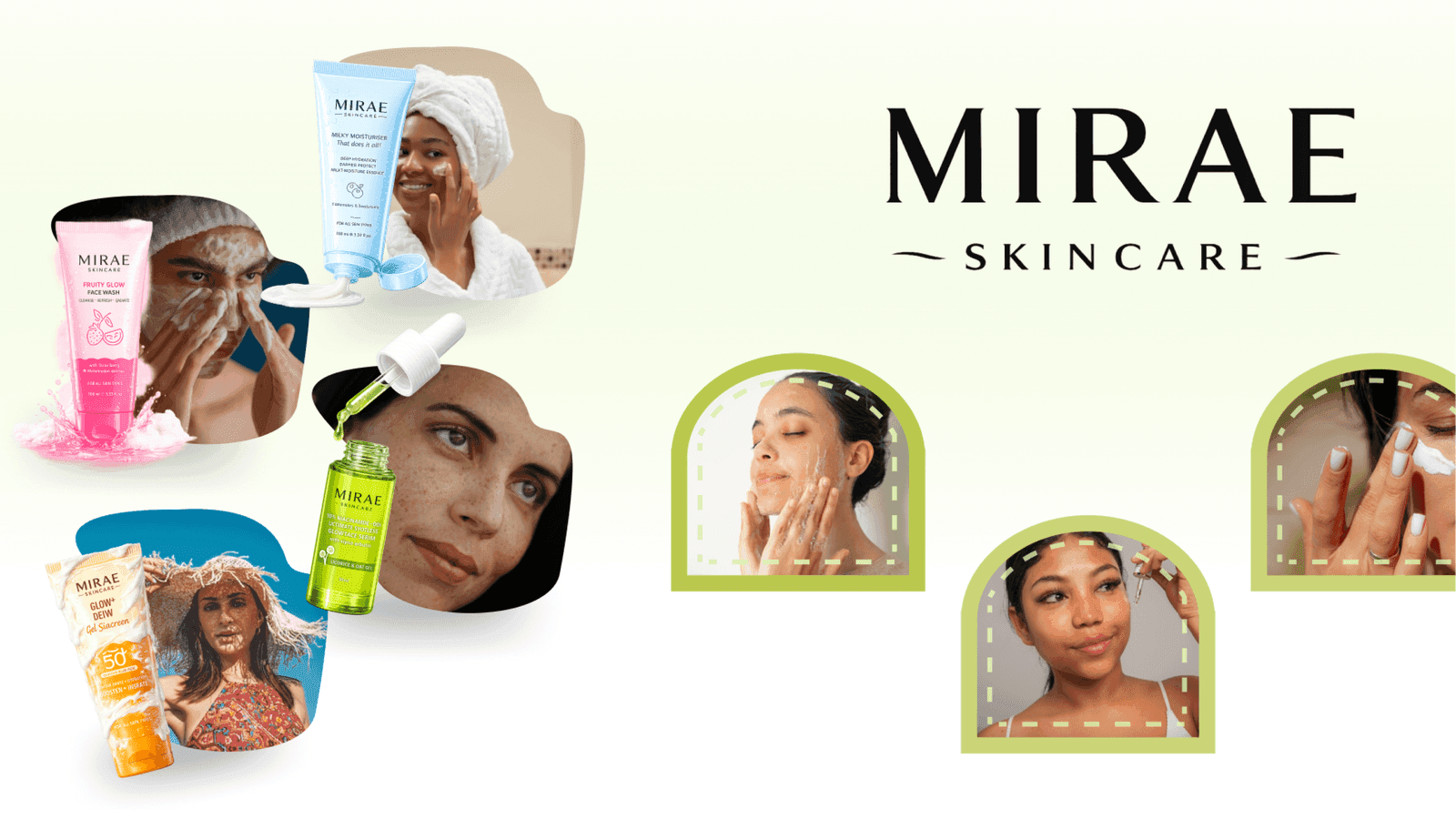
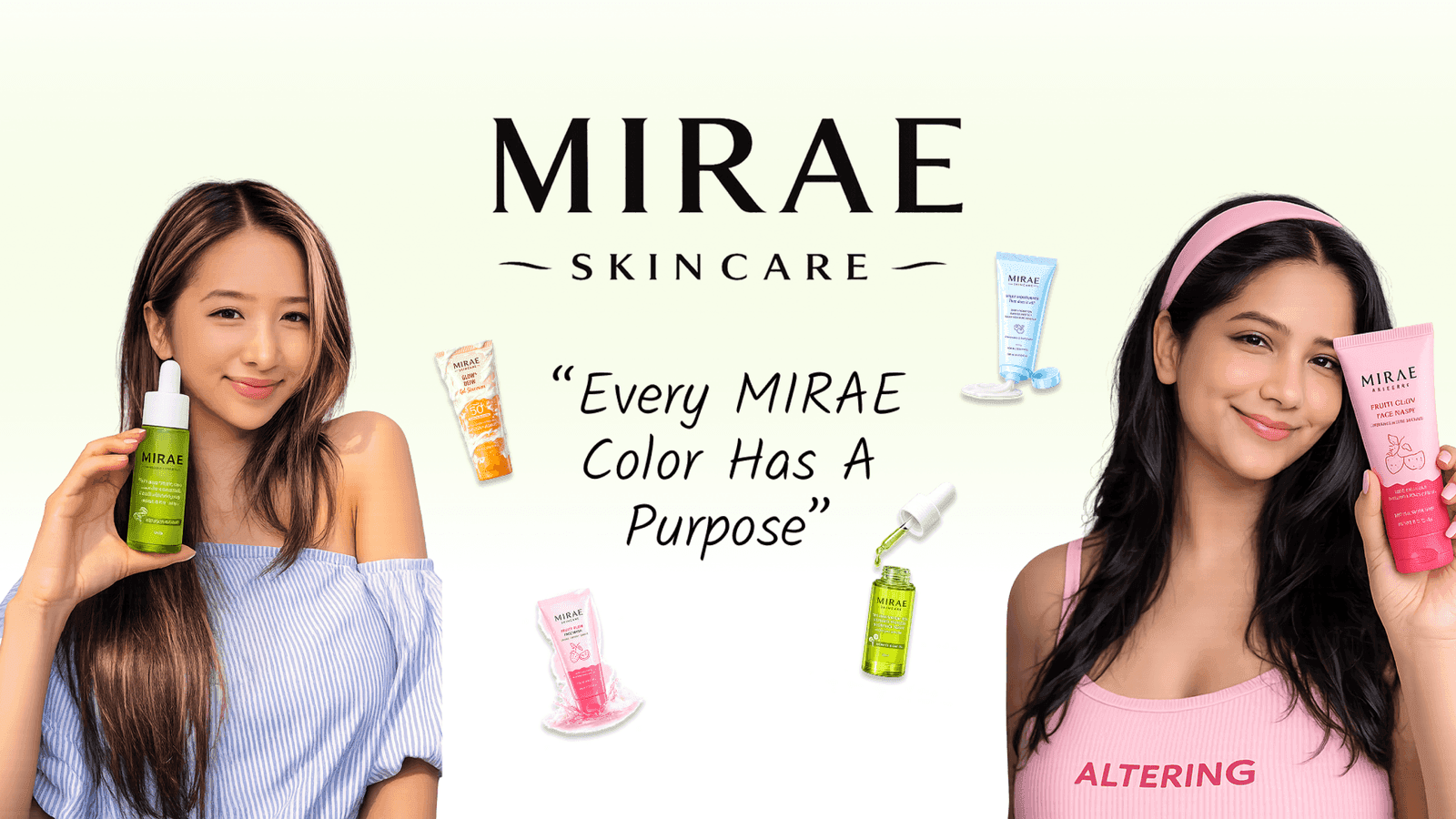
The showcase features Mirae's primary logo lockup, icon-only mark, and packaging and social applications, demonstrating consistency across every format, size, color, and background used.
Whether you need scalable software development, AI integration, SEO optimization, or complete digital transformation, our team is ready to help your business grow globally.
Business Challenge
Mirae's brand identity needed to sit between three distinct personalities at once: luxury skincare, clinical skincare, and modern beauty, without feeling like a compromise between them. As a brand new to market, Mirae had no existing visual equity to build from, so the logo alone had to establish instant credibility and recognition. It also needed to work everywhere a beauty brand appears, tiny packaging labels, app icons, social avatars, printed collateral, and large signage, without losing clarity or impact. On top of that, the mark had to feel timeless rather than trend-driven, since skincare packaging and branding are expected to last for years without a redesign.
As a brand entirely new to market, Mirae had no established visual identity to build from, meaning the logo alone had to create instant recognition, trust, and lasting credibility.
The mark had to feel luxurious, clinical, and modern all at once, without leaning so far into any single direction that it lost the other two qualities entirely and felt one-dimensional.
The logo needed to stay clear and impactful on tiny packaging labels, app icons, social avatars, and large printed materials, across very different sizes, backgrounds, and physical materials.
Skincare packaging and branding are expected to last for years without a refresh, so the mark had to feel timeless and enduring rather than tied to a passing, short-lived design trend.
The logo needed to visually reflect the deeper meaning behind 'MIRAE,' future beauty and transformation, rather than being a generic, interchangeable mark used across the beauty industry.
Strategic Approach
IM Digital approached Mirae's logo through minimalist typography, letting clean letterforms and careful spacing carry the premium feel instead of relying on decorative elements that date quickly. We explored directions rooted in the meaning of 'MIRAE,' future beauty and transformation, refining proportions until the mark felt equally at home on a premium packaging label and a clinical ingredient callout. Every version was tested at extreme sizes, from a small social avatar to large print signage, to confirm it stayed sharp and legible everywhere. The result is a flexible, distinct mark that anchors Mirae's luxury black, beige, and pink identity across every future application.
We built the mark around clean, minimalist letterforms and careful spacing, letting typography alone carry a premium feel instead of relying on decorative elements that age quickly or go out of style.
Concepts were developed directly from the meaning of 'MIRAE,' future beauty and transformation, giving the final mark a distinct, ownable story rather than a generic, interchangeable beauty industry look.
We refined proportions and detailing until the logo felt equally credible on a premium packaging label and a clinical ingredient callout, bridging luxury positioning and scientific credibility in one single mark.
The mark was tested from small social media avatars up to large printed signage, confirming it stayed sharp, balanced, legible, and instantly recognizable at every possible size, format, and background.
We delivered primary, alternate, and icon-only lockups so Mirae's team could apply one consistent mark across packaging, digital platforms, and print without ever compromising clarity or brand recognition.
Result
The new mark gave Mirae instant visual consistency across packaging, digital, and print, strengthening brand recognition and giving every other design decision a clear anchor to build from.
+55%
Brand Recognition
+40+
Packaging SKUs
4
Platforms Rebranded
-35%
Approval Turnaround
Whether you need scalable software development, AI integration, SEO optimization, or complete digital transformation, our team is ready to help your business grow globally.
Explore more software, AI, SEO, and digital marketing projects where we've helped brands achieve real, measurable growth.
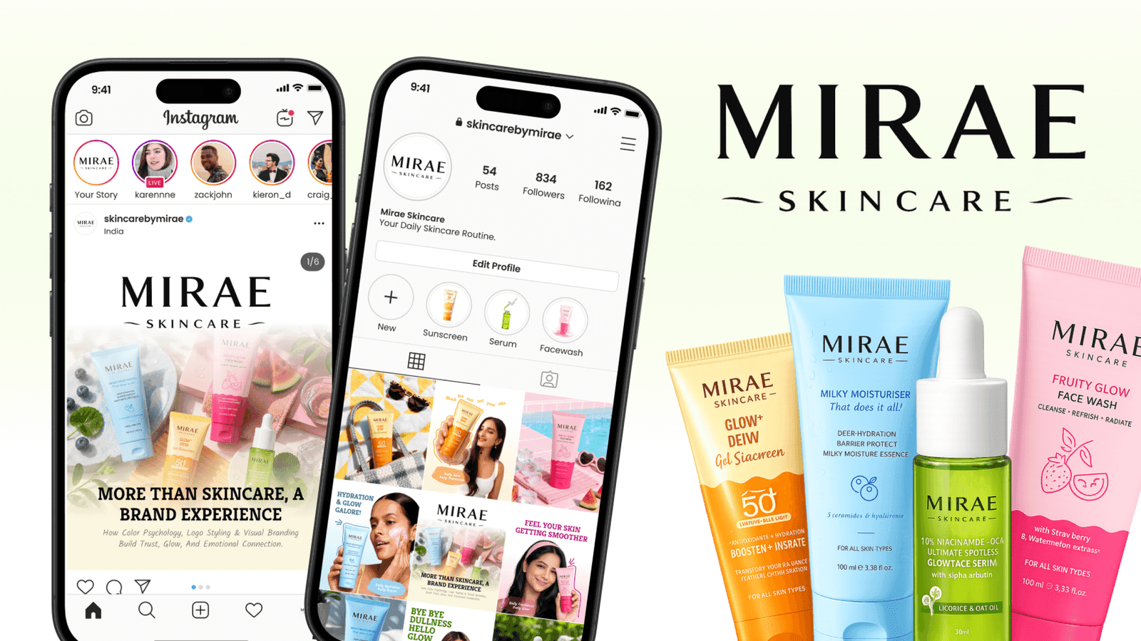
IM Digital runs Mirae Skincare's social media strategy, turning ingredient education, transformations, and product launches into engaging content across Instagram, Facebook, TikTok, and Pinterest.
IM Digital created a premium UI/UX direction for Mirae Skincare with product discovery, routine guidance, beauty storytelling, and conversion-focused shopping flow.
IM Digital built Mirae Skincare's brand strategy and identity system, defining positioning, voice, personas, color palette, and typography for a consistent, premium skincare brand.
Browse our complete portfolio of digital work across every industry we serve.
Explore Our WorkA strong skincare logo balances credibility with warmth, so it reads as scientifically trustworthy without feeling cold or clinical. Mirae's mark had to sit between luxury, clinical, and modern beauty positioning at once, using clean minimalist letterforms and careful spacing instead of decorative elements that would age quickly or blur that balance.
Testing a mark at extreme scales, from a small social avatar up to large printed signage, is how multi-format versatility gets built into a logo before it's finalized. Mirae's team delivered primary, alternate, and icon-only lockups that stayed sharp and legible everywhere, supporting a rebrand across 4 platforms and more than 40 packaging SKUs without losing clarity.
Most logo concepts fall back on generic industry visual cliches instead of what a brand's name actually means. Mirae's mark was built directly from the meaning behind 'MIRAE,' future beauty and transformation, giving the letterforms an ownable narrative that a decorative, trend-driven design could never carry through meaning-rooted concepting.
Premium beauty brands often choose minimalist logo design because clean letterforms and careful spacing carry a luxury feel without relying on decorative details that age quickly. This approach helped Mirae's Logo Design mark lift brand recognition by 55% while cutting approval turnaround time by 35%.
Getting started typically means sharing your brand name, positioning, and any existing visual references before concept exploration begins. From there, a designer develops minimalist logo directions, tests them across real applications, and refines the strongest option into a finished mark. Contact to start your logo design project.

 Get a Quote