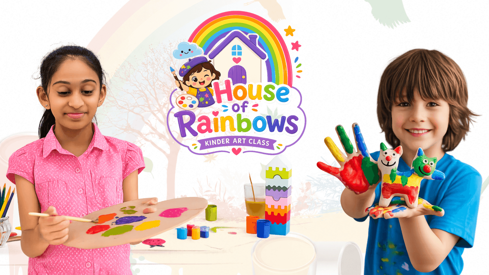
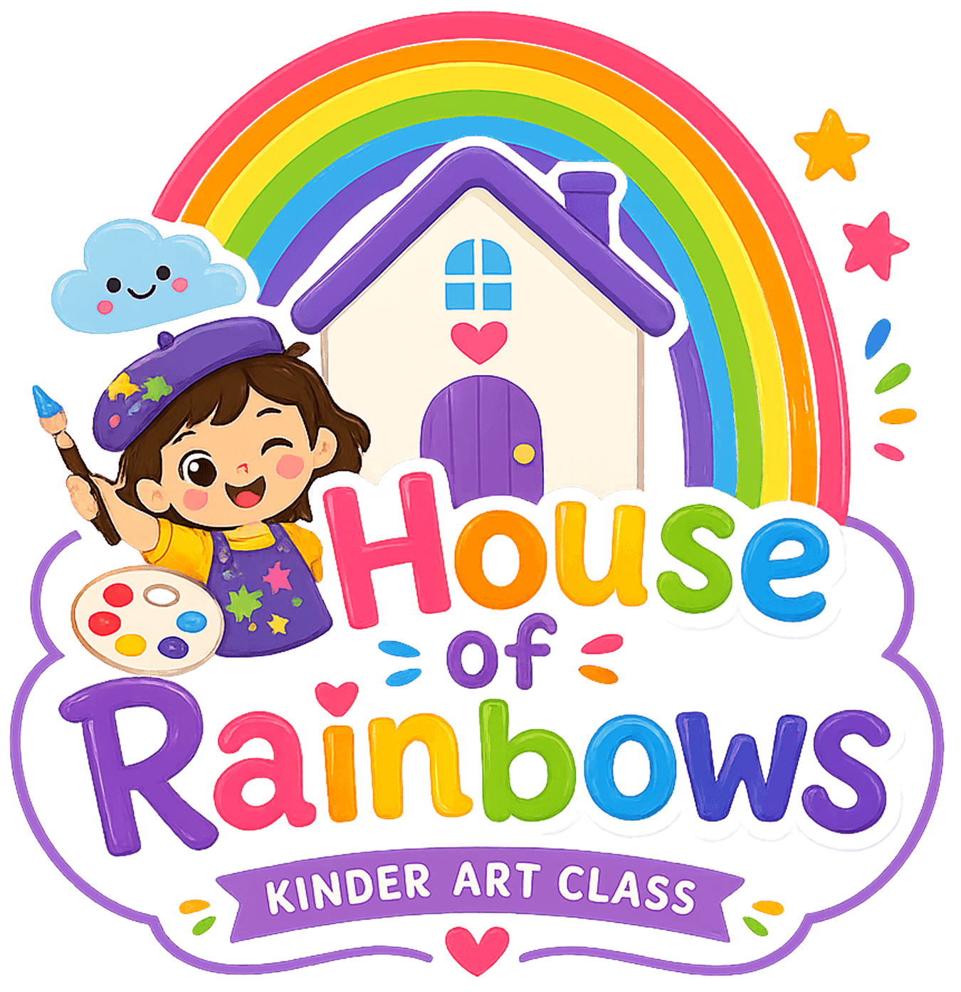
IM Digital designed a colorful, playful logo for House of Rainbows, translating creativity and childhood joy into one versatile mark used across signage, uniforms, digital, and print.
Project Name
House of Rainbows
Industry
Education - Art and Craft Centres
Category
Branding & Design
Services
Logo Design
Project Overview
House of Rainbows needed a logo capable of carrying its full brand story: playful enough to excite children, trustworthy enough to reassure parents, and distinctive enough to stand out among generic kids' activity logos. IM Digital led the logo design process, exploring a mark combining a rainbow, a house icon, and playful children's illustrations that reflected creativity, learning, and a safe environment. The final mark stayed flexible enough to work across classroom signage, uniforms, the website, and printed materials. The result combines bright color with friendly, rounded typography, giving House of Rainbows a distinct, joyful identity that anchors every family touchpoint.
Project Summary
IM Digital designed House of Rainbows' primary logo mark, exploring a rainbow and house icon combination that balances childlike joy with genuine parent trust across every application.
House of Rainbows needed a logo that could visually express creativity, safety, and childhood joy, without feeling generic or interchangeable with other kids' activity centers. The goal was a colorful, distinctive mark rooted in the rainbow and house symbolism that worked across classroom signage, digital platforms, and print, and gave the growing academy a strong, recognizable anchor to build parent trust from.
We studied the meaning behind House of Rainbows, creativity, learning, and a safe environment, translating those ideas into initial directions for the rainbow and house symbolism from the start.
We explored multiple concepts combining a rainbow, a house icon, and playful children's illustrations, testing how each balanced childlike joy with genuine parent trust before narrowing down.
We refined the selected concept's colors, proportions, and typography, testing legibility and impact at different sizes before finalizing the primary logo mark and its full set of variations.
We tested the finished logo across classroom signage, uniforms, the website, and printed materials, confirming it stayed bright, clear, and recognizable in every single format it appeared in.
Service Delivered
IM Digital delivered House of Rainbows' primary logo, alternate lockups, and a usage-ready file set, giving the academy one consistent, versatile mark across signage, digital, and print applications.
Service Showcase
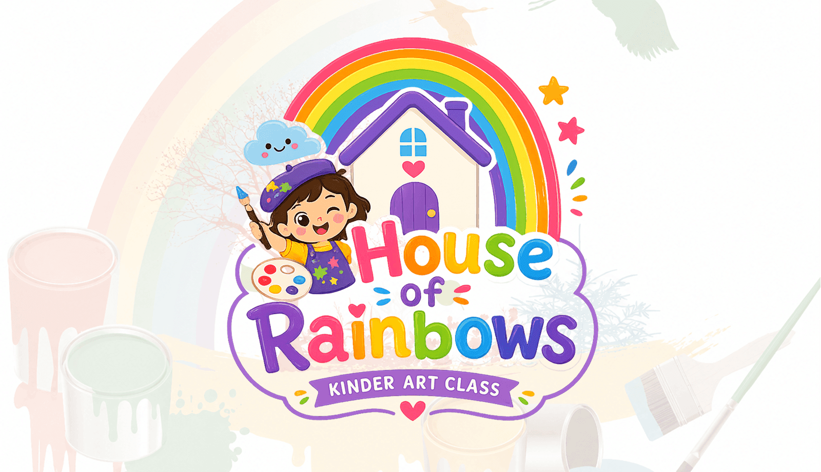
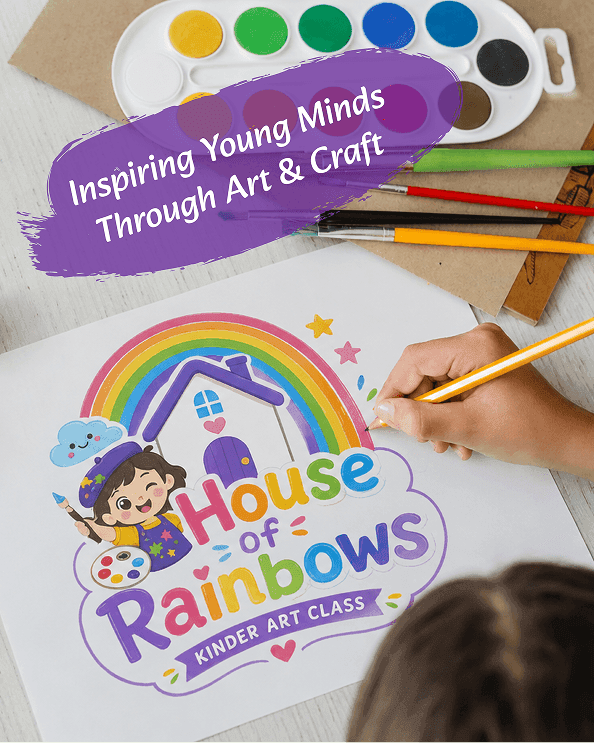
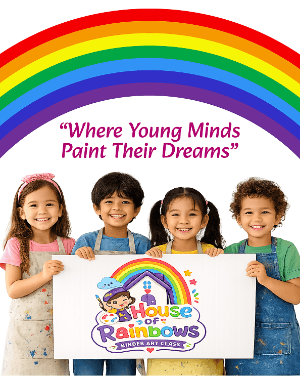
The showcase features House of Rainbows' primary logo lockup, icon-only mark, and signage and uniform applications, demonstrating consistency across every format, size, and background used.
Whether you need scalable software development, AI integration, SEO optimization, or complete digital transformation, our team is ready to help your business grow globally.
Business Challenge
House of Rainbows' brand identity needed to feel playful and exciting enough for young children while still reading as safe and credible enough to reassure comparison-shopping parents. As a growing creative learning academy, House of Rainbows had limited existing visual equity, so the logo alone had to establish instant recognition among families choosing between local activity providers. It also needed to work everywhere the brand appears, classroom signage, staff uniforms, digital platforms, and printed materials, without losing clarity at small sizes. On top of that, the mark had to avoid generic rainbow or crayon clichés common in kids' branding, while still feeling unmistakably joyful.
The mark had to feel exciting and colorful enough for young children while still reading as safe and credible enough to reassure parents choosing a new provider for their own child.
Many children's education logos rely on generic rainbows or crayon icons, and House of Rainbows needed a mark that avoided those clichés while still feeling instantly recognizable to families.
As a growing academy, House of Rainbows had limited existing visual equity, meaning the logo alone had to build instant credibility among parents comparing several local providers first.
The logo needed to stay clear and impactful on classroom signage, staff uniforms, digital platforms, and printed materials, across very different sizes and backgrounds entirely and everywhere.
The mark needed to feel distinctive and ownable while still reading immediately as a fun, safe, and creative learning environment to first-time visiting parents browsing online today.
Strategic Approach
IM Digital approached House of Rainbows' logo by combining a rainbow, a house icon, and playful children's illustrations, letting the mark itself communicate creativity, safety, and childhood joy without generic kids' branding clichés. We explored directions rooted in the brand's actual name and mission, refining colors and proportions until the mark felt equally credible on classroom signage and a parent-facing enrollment page. Every version was tested at extreme sizes, from a small app icon to large classroom signage, to confirm it stayed sharp and legible everywhere. The result is a flexible, distinct mark that anchors House of Rainbows' rainbow identity across every family touchpoint.
We built the mark around a rainbow, house icon, and playful children's illustrations, letting House of Rainbows' actual name and mission carry meaning instead of relying on generic crayon or paintbrush icons common industry-wide.
We refined colors and proportions until the mark felt equally credible on classroom signage and a parent-facing enrollment page, bridging childlike joy and genuine parent trust in one single, cohesive mark built to last.
Concepts were developed directly from House of Rainbows' actual name and mission, giving the final mark a distinct, ownable story rather than a generic, interchangeable kids' education logo used industry-wide.
The mark was tested from small app icons and uniform embroidery up to large classroom signage, confirming it stayed bright, clear, and instantly recognizable at every possible size, format, and background.
We delivered primary, alternate, and icon-only lockups so the academy's team could apply one consistent mark across signage, digital platforms, and print without ever compromising brand recognition anywhere.
Result
The new mark gave House of Rainbows instant visual consistency across signage, digital, and print, strengthening brand recognition and giving the growing academy a joyful, trustworthy anchor.
+52%
Brand Recognition
+6+
Signage Rollouts
3
Platforms Rebranded
-30%
Approval Turnaround
Whether you need scalable software development, AI integration, SEO optimization, or complete digital transformation, our team is ready to help your business grow globally.
Explore more software, AI, SEO, and digital marketing projects where we've helped brands achieve real, measurable growth.
IM Digital crafted a conversion-focused UI/UX for House of Rainbows, a children's creative learning center, covering program discovery, age-based curriculum, and enrollment flows for busy parents.
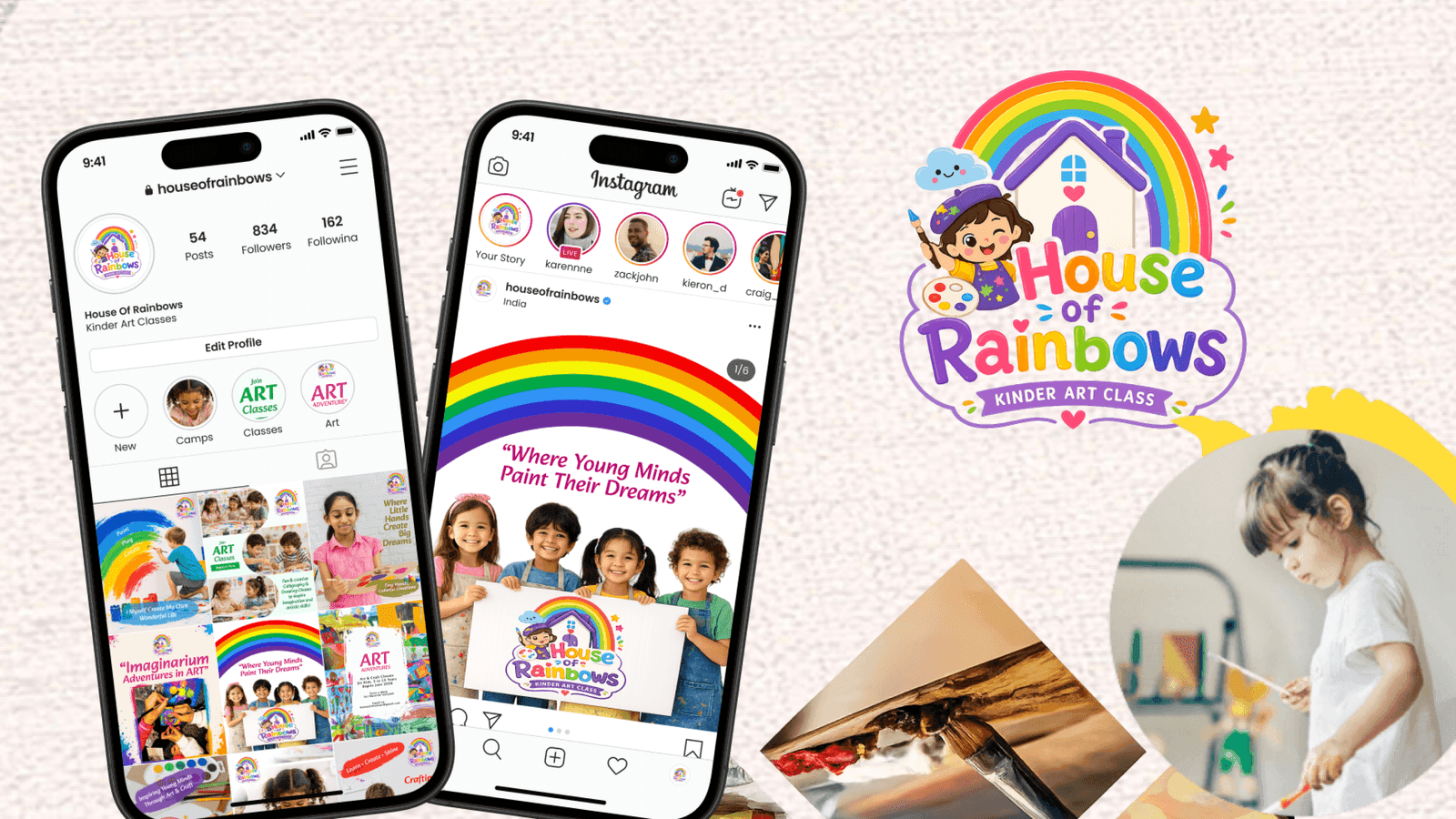
IM Digital runs House of Rainbows' social media strategy, turning student artwork, classroom moments, and camp highlights into engaging, colorful content across Instagram and Facebook.
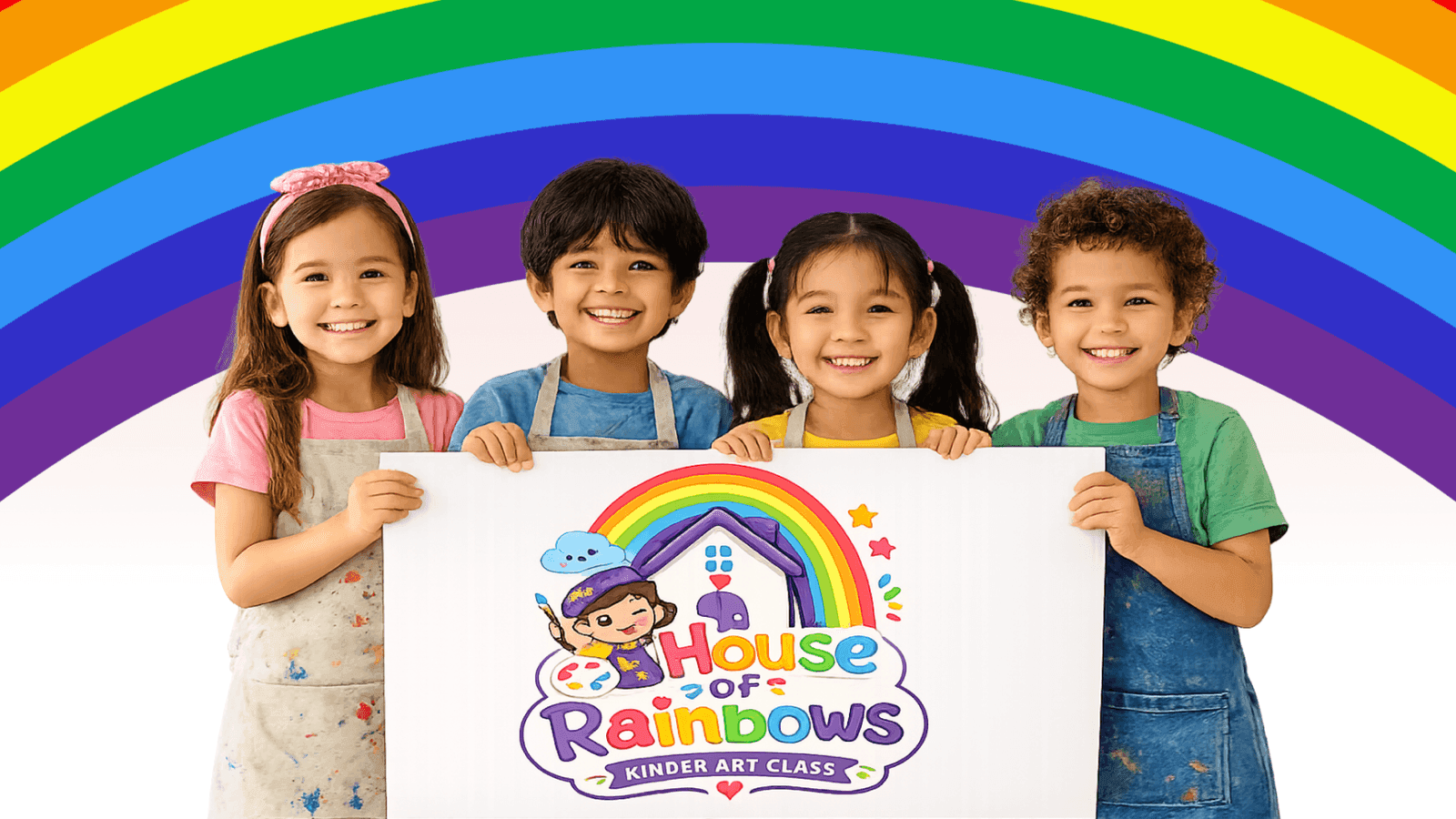
IM Digital built House of Rainbows' brand strategy and identity system, defining positioning, voice, family personas, color palette, and typography for a consistent, joyful academy.
Browse our complete portfolio of digital work across every industry we serve.
Explore Our WorkA strong children's education logo balances childlike joy with genuine parent credibility instead of leaning on generic rainbow or crayon clichés. House of Rainbows' mark combined a rainbow, a house icon, and playful illustrations rooted in its actual name and mission, giving the growing academy instant recognition among parents comparing several local providers.
Brand recognition climbed 52% after House of Rainbows launched its new mark across signage, digital platforms, and print. The logo's rainbow-and-house symbolism gave the growing academy visual equity it previously lacked, while a flexible lockup system supported six-plus signage rollouts and rebranded three platforms without losing consistency.
Yes, generic rainbow or crayon icons make a kids' brand blend into countless local competitors instead of standing out. House of Rainbows' team explored concepts rooted in the brand's actual name and mission, combining a rainbow, a house icon, and playful children's illustrations into a distinctive mark families remember and trust.
Versatility depends on testing a single mark at extreme sizes, from a small app icon to large classroom signage, before finalizing it. House of Rainbows' primary, alternate, and icon-only lockups stayed bright and legible on uniforms, signage, and digital platforms alike. Learn more about our Logo Design process for education brands.
Getting started means sharing your brand's mission and current visual assets so the design team can identify what's missing before sketching concepts. IM Digital researches brand meaning, explores multiple directions, then tests the finished mark across every real-world application. Contact our team to begin a logo project for your academy.

 Get a Quote